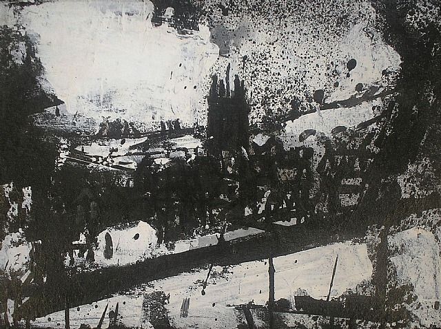
John Virtue is an English landscape painter whose work rides a fine line between abstraction and figuration.
For his work, Virtue takes a great deal of inspiration from artists such as Turner and Constable, however, he’s also greatly influenced by American abstract expressionism and oriental brush painting.
Virtue focuses on the landscapes around where he happens to live. At the beginning of his artistic career he lived in Devon, and used the Exe estuary as his subject. He now lives in London, hence why his landscapes have turned down a more industrial route.
http://www.artnet.com/artists/john-virtue/landscape-no-256-Kovn7WVO7iG6ALR5-x9PUA2 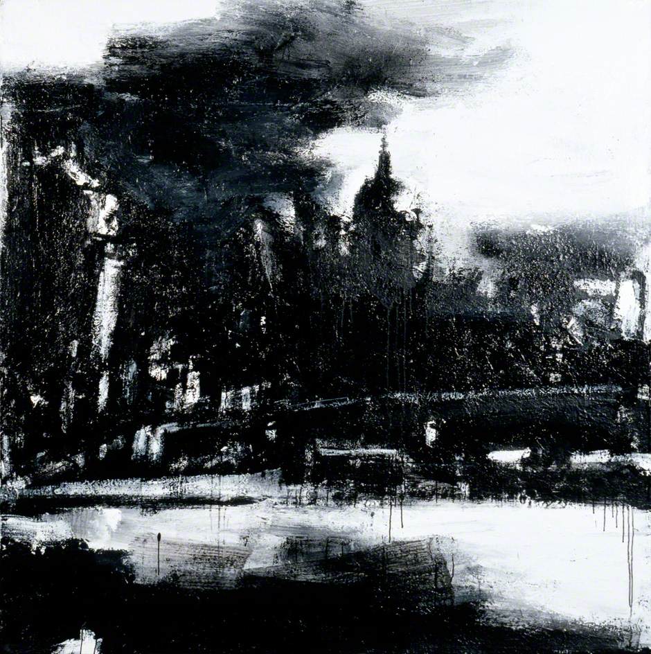
http://www.artuk.org/artworks/landscape-no-664-29490 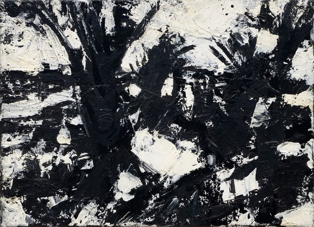
http://www.artnet.com/artists/john-virtue/landscape-no-230-y3Haee5ew9y_PzJJJswi4A2 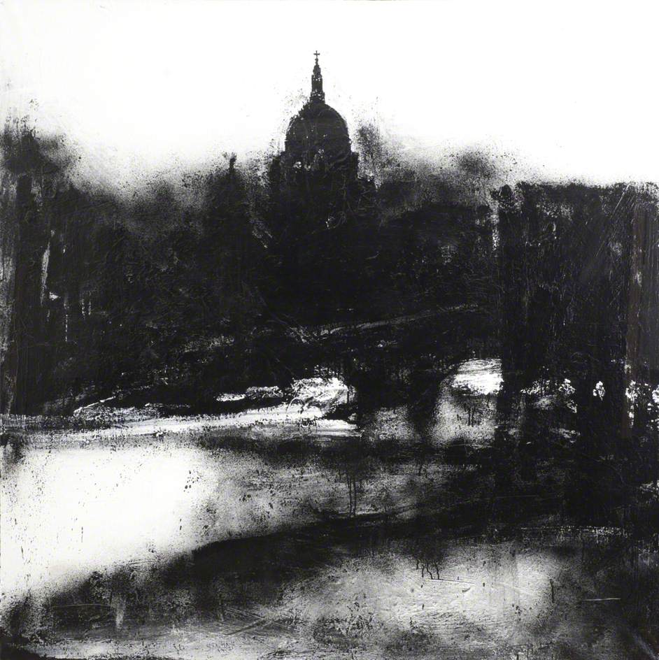
http://www.artuk.org/artworks/landscape-no-739-219454 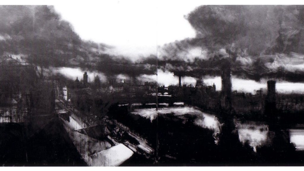
https://www.widewalls.ch/artists/john-virtue/auction-results
As you can see above, Virtue works solely in black and white, executing all of his paintings on canvas using white acrylic paint, black ink and shellac.
I absolutely love these paintings. I’ve not come across John Virtue before, but I’m exceptionally happy that I have. I have had some ideas in the past that are similar to these pieces, however, for some reason or other, I’ve always seemed to steer in another direction.
It’s impossible not to be sucked into these pieces.
The contrast in tone is nothing spectacular, but it drew me in and I find it absolutely fascinating. One thing that I noticed, or rather interpreted, from these pieces is that they are very full of weather. The day seems overcast, full of clouds and a bit grim, which is reflected beautifully in his use of media. The dark tones completely take over the paintings, and the only way you’re able to really recognise a building or a bridge or an edge of a building is through Virtue’s use of lighter tones; the white acrylic that he uses to portray the windows and light reflections in the above paintings is a small section, but a huge part in transforming them into something bigger.
Another thing that I noticed is the use of layering; a technique that we focused on in a previous exercise.
Although the artist doesn’t use a great amount of detail in his work, I noticed that the further the distance from the viewpoint, the focus lessens; edges become softer, changes in tone become subtler, and subject structures are vaguer. It’s tricky to notice these details in Virtue’s work as he hardly works in a highly defined and specifically detailed manner, but it’s there.
I experimented in a few landscape exercises with black and white, however, this was only through the use of charcoal and blank space. It would be really interesting to have a go at creating a landscape similar to Virtue’s – the same approach, the same media, and, as we both live in the same city, even the same surroundings!
