Assignment Criteria and Reflection

Coursework

Demonstration of Technical and Visual Skills (35%)

Materials:
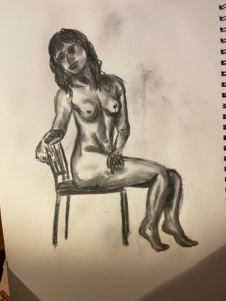
In my final piece, I think I’ve explored the use of materials well. I didn’t limit myself, instead, incorporating a large amount of materials in the piece. Over time, I’ve learnt more about the use of different materials/mediums and what they are best for. For example, I know that charcoal sticks and pencils are good for quick work and developing tone. For bolder and larger pieces, I would perhaps opt for my pastels and/or pens. I wouldn’t say I favour a particular medium; I enjoy working with charcoal, pencil and fine liner, however, instead of creating a piece with the material I’m most comfortable with, I wanted to show what I’ve learnt with all the materials that I’ve used over the past year or so.

Techniques:
I’ve discovered what works best for me, and in my final piece, I’ve worked with my strengths. I would have liked to work with things that I’m not as comfortable with, to show my progression in those areas, but I already felt anxious approaching the piece and didn’t want to put myself too far out of my comfort zone. The techniques I’ve developed and learnt to love are displayed within this piece – mark making, working in line, working in tone, incorporating colour in different ways.

Observational Skills:
My observational skills have improved hugely over the duration of the course. Beforehand, I was very critical of my work and often didn’t take much time to observe all the individual aspects of it. Over time, and with help from my tutor, I have learnt how to critique my own work positively. I spoke in depth on my final piece about the areas that I would change, areas that I wasn’t happy, with, and areas that I am pleased with. I’ve learnt that it’s important to be able to assess your own work accurately, as it shows you where your strengths/weaknesses are and where improvement is needed. One thing that I’m aware of, is that I need to take my time. With all of it. The preliminary sketches, the final piece, all of it. I’ve definitely improved in this area over the course of the unit, but it still needs to be worked on. This is something I’ve made note of to take into my next unit.

Visual Awareness:
Over the unit, I’ve realised more and more how important visual awareness is. When drawing items in the past they’ve not looked quite right or there’s been things missing from them, and, on further inspection of the subject I’m drawing, things jump out at me or I notice aspects that I hadn’t before. This might be highlights where the light hits a tree branch, a small bodily feature, a mark upon an object such as a chip or a crack. Adding these small but important features can sometimes transform a piece. Recently, I have taken extra care in inspecting the subjects I am drawing carefully, zooming into small areas, and transferring as many of the details I am able to seek out onto paper. Instead of rushing through the drawing and taking time to sit and observe the subject for things I’ve missed, I’ve been able to strengthen my drawing skills and my visual awareness in all areas. As I worked with more colour this time, I found this a little more difficult, as I’m more used to working in black on white. When working in colour there are so many more things to consider, such as tones and the spectrum of a specific colour. For example, there isn’t just light green, mid green and dark green, there are hundreds of different shades, and this was something I hadn’t really considered until I was applying it to my work. It was interesting and something I will definitely be mindful of in the future.

Design:
I feel completely confident that my designs are creative, and that I’ve taken into consideration the areas of improvement and areas that I am strongest in, as discussed by myself and my tutor. Whilst I stayed within what I know and what I feel strongest with, I have also been bolder and more experimental in my choices, as I don’t want to restrain myself. I am a bold and ambitious person, and I wanted to display this through my work, which I think I have.

Compositional Skills:
I never approach my drawings with a set guide to how I will compose it. I just sort of see what comes to me. I’ve become very good at using light pencil or charcoal to map out my pieces, however. Beforehand, I would just draw the figure and if it was wrong I would do it again and again and again until it was right. Now, I will lightly map out the edges of my subject, and then build upon that, applying a more permanent line/tone as I go along. This isn’t how everyone would do it, but it’s what works best for me. I have experimented with grids and such before, but I find them frustrating and they don’t work for me. Of course, I will continue to experiment with composition techniques, but for now, I am happy with ‘mapping’. It feels safe and I feel confident with it.

Quality of Outcome (20%)

Content:
I feel confident that my content for my final piece is interesting and unusual. I’m happy that the outcome of my final piece links to what I discussed in my artist’s statement, and that I’ve accurately portrayed my message/meaning.

Application of Knowledge:
I’ve learnt many things through this course, and I think I have applied them well in this piece. I’ve tried my best to apply things that my tutor has flagged up to me as areas for improvement, and areas of strength. I made a point to reflect back to previous pieces to ensure I was incorporating previously learnt skills and techniques, and I can only hope my tutor agrees.

Presentation of Work in Coherent Manner:
I am very organised and like things to be kept in an orderly manner, which, I think, reflects in my learning log. It’s easily accessible, my work is well presented, and each exercise/task is chronologically displayed. One thing that I feel could be improved, is my preliminary work and discussion on how I reached a certain conclusion.

Discernment:
I think I have displayed a strong and healthy judgement of my work through my learning log. I’m able to discuss areas that I feel need improvement, areas I’m confident with, and reflect well on feedback given. I spoke with people regarding my final piece and gained a lot of feedback from friends and my partner on their thoughts on my work, which is something I’ve never felt confident to do before. I think it’s important to do this, as these are the people that will be most honest. I am realising the importance of self-critique more and more as the course proceeds.

Conceptualisation of Thoughts:
I am quite decisive in my decisions. When I read a brief, I get an idea in my head of what I want to do, and it’s rare that I shift from that decision. I may branch out a little with my concepts of that idea, but it’s not often I fully change my mind. When I read the brief for this piece, I knew exactly what I wanted to do, but I wasn’t quite sure how to approach it. I think I’ve done well at transferring my thoughts and ideas onto paper (or canvas in this case), and I think I’m getting better at discussing the decisions and thoughts I have. Perhaps, I could be a bit more experimental and allow myself to branch out a bit more, but, also, I don’t think I work that way.

Communication of Ideas:
As mentioned above, discussing my ideas and thoughts is something I am getting better at, however, I think it could improve. Even just making messy notes in my sketchbook of a thought process or idea could be useful. I don’t make many notes within my sketchbooks, I just leave it until I’m writing in my learning log, but, maybe it would be useful to have a place to scrawl in whilst I’m working.

Demonstration of Creativity (25%)

Imagination:
Without a doubt, this has been my most imaginative piece yet. I think the concept that I have displayed is a really interesting one. When I asked my tutor if I were able to incorporate two different aspects in this one piece, she advised me that she thought it would suit me to do that. I have also been repeatedly advised to experiment and try and show some of myself through my work. My tutor has also said to me before to remember that the briefing is just a guideline, and that I am free to go bigger and bolder and do with it what feels right. I have really tried to do that with this final piece, and I felt and feel so much more comfortable with it. It feels more ‘me’. I now feel way more confident in pushing boundaries and getting riskier with my work, and creating something bigger and bolder.

Experimentation:
I’ve said this before, but I think my experimentation could be better. I don’t have much time to be overly experimental, as I work full time and things seem to just get on top of me. I also feel, as mentioned above, that once I get an idea in my head I want to just get on with it and I don’t want to spend time experimenting on something I know I want to do. I think this is pretty narrow minded, and I’ve had to remind myself multiple times that it’s all part of the learning process, and when I have taken the time to experiment with things that my work often turns out better. Areas that I definitely do need to take time to experiment with and work on is the areas that I’m feeling less confident in.

Invention:
I think I’ve been far more inventive in part 5. I’m happy that my piece is bold and feels more like something I would create. Again, I think this is because I’m thinking outside the box and I felt that I was given more free rein. Slowly but surely, I can see originality and a more interesting quality creeping into my work.

Research:
I completed some research on artists that inspire me and artists that my tutor recommended and I found this both enjoyable and really helpful. I felt this would be really useful in the outcome of my final piece, as I was able to magpie certain techniques and features that I liked from other artist’s work and experiment with them in my own work.

Critical Thinking (Learning Logs):
My learning log is where I put all my thoughts. I find that it goes up and down in formality. Sometimes it’s as though I’m chatting with a friend, and sometimes its as though I’m writing an assignment. Either way, it’s really helpful and has supported me massively in my work. As mentioned above, I do think some things do get left out, which is why I think it would be useful to have something to jot my thoughts and ideas down so I don’t forget them. This will be useful in building up a more accurate representation of my progress and my working process.

Assignment 5

Coursework

I began my final piece by choosing the subjects that I wanted to incorporate. I took full advantage of being able to create on whatever scale I wanted to, and I’ve been dying to put one of the A4 canvas boards that I have had in stock for a long time now, so that’s what I chose to use for my final piece.

As always, I’m not the best at remembering to document my progress, so I was quite far into the piece before I actually realised that I hadn’t taken any pictures or made any notes! Whilst experimenting with different approaches for this piece, I really enjoyed working with watercolour, and I wanted to inject some colour into the piece. As I had made the decision to incorporate nature within my piece, I began by adding a green watercolour wash to the board. I really enjoyed building up the greens, however, I did find it a little annoying how whenever I felt that the green wash was bold enough, it seemed to fade when dry. But, after some time and a lot of layers of paint, I was able to achieve a background that I was happy with. Persistence and patience was key!

Then, using a charcoal pencil I began adding the human figure, who is a friend of mine. I knew from the start that I wanted to draw a female figure. I’ve loved learning how to draw the different parts of the body, and I’ve enjoyed sketching the female body the most. My friend is beautiful, wonderfully natural and very comfortable with her body which is exactly what I wanted to portray through my piece. It was at this point that I realised what exactly I wanted to show through this piece – Mother Nature, and the relationship between us and planet earth. I had planned for this to be the point of my final piece, but it was at this point (when I was actually creating the final piece!) that it truly hit me how important it was for me to depict this as powerfully as possible. We need each other to thrive, and I wanted to display this. The human race are slowly but surely killing planet earth, and are the only ones who can keep it alive and well.

As you can see above I began by pencilling her form onto the background with the charcoal pencil.
Slowly, I worked up the layers of line and tone and soon, there she was. I felt much more confident once I had something to work with. Beforehand I had been slightly unsure as to where the piece would head, but once I’d added the figure, things felt like they would just come from there. I wasn’t exactly sure how I was going to portray the connection between her and the environment around her, but, in my preliminary sketches I toyed with the idea of merging her limbs into trees and roots.

Once I’d combined these features, I felt absolutely confident that I’d made the right choice. From there I used a sponge to dab the colour and texture of foliage around the branches, and swept the paint across the roots of her ‘feet’ along the bottom. Again, I had to add many, many layers of watercolour as each time it dried, the colours and textures seemed to fade. I think building up these layers was really effective in my depiction of the leaves. The more layers added, the thicker the foliage seemed, and the more realistic. It was actually Paul Evans that inspired much of my technique for building up the landscape in this piece. He uses a combination of smudging and paint splattering to build up his landscapes, and I wanted to apply something similar in this piece as the effect he achieves is great.

From there, I just kept adding and adding to the foliage. I dabbed all the greens and browns that I could find into the leaves, branching out from watercolours to thicker mediums like acrylic and even a small amount of oil paint. It was not until I inspected the piece more closely that I was really able to see the full effect of this, and the true range of colours that builds up the trees.

For the ground/roots, I thickly applied paint to represent the earth and the blades of grass coming out of it. It was around this point that I felt my piece was strongest. I much preferred the appearance of it in the images before, however, it seemed weak. I liked how clear all the features I had added were, but it just seemed unfinished. On adding these additional colours and textures, the piece began to feel far bolder and I found it was more interesting. I asked my partner for his thoughts, and he agreed with me that with further work and added details, the piece seemed to ‘pop’ that bit more.

As you can see at the bottom of the piece, I have splashed a small amount of ‘rust’ coloured paint to break up the blocky brown. Also, as the additional colour covered much of the roots, I had to go over them. I used black oil pastel to try and bring the roots back out, but it didn’t seem like the right medium. I needed something stronger and thicker to stand out and stick against the layers of acrylic and oil.

Looking back, I think this is where I should have left the piece.

I thickened up the branches and roots with a thin brush and Chinese ink. I loved the movability of the Chinese ink, and really wanted to incorporate it into the piece. I think the effect of it here is subtle but strong, which is exactly what I was going for. However, that didn’t feel like enough, so I used a chalk pencil to add subtle highlights. I learnt before, when focusing on trees, that highlighting is a small but extremely effective technique to portray light hitting an area. It’s a small addition, but it really transforms a piece. I simply added a few white lines here and there along the edges of a few branches, and to accentuate the roots and blades of grass, which I found to be a really effective and transformative choice.

Like I said, I wish I had left the piece as it is here. It looks strong, and I feel that my message is portrayed clearly. The contrast in tone and colours is strong, and each feature is bold and clear, whilst remaining understated.

Final Outcome:

I made a bold decision to go on and add grass at the bottom of the piece. I wasn’t happy with the blend from the legs into the ground, so I wanted to have a go at rectifying that. I thought adding grass would be a good way to express my mark making and linear skills. With a very small, narrow brush I added the grass, which covers the bottom third of the board.

Something I haven’t consciously practiced in a long while is layering up a piece. The background of the piece is obviously the blend of the watercolours on the background, the model and her tree arms are the middle-ground and at the very foreground is the grass. I have found it difficult to establish the different grounds and layers of a drawing/painting in previous pieces, and I wanted to make a point of showing this in my final piece. I think I have achieved this quite well, especially with the grass. As you can see, the grass displayed in the foreground is clear and you can see the individual colours and shapes of each blade, however, the further into the distance the grass gets the more unfocused and merged they become. It gives the impression that the woman is walking towards the viewer through the long grasses around her.

I spoke with my partner about the middle are of the piece, as I felt it seemed empty. I wanted to add something more, to fill it up and to make it a bit more interesting, but he advised me to leave it as it is and simply discuss in my log what I would do going forward. I was anxious that if I added to the piece any more, it would spoil it. I wasn’t sure (and I’m still not) what I wanted to add to this area, but just felt that it needed something. Maybe a meadow fading into the distance, or a wall/fence to break the area up.

Regarding the woman, I am feeling really pleased with how she has turned out. If I were to alter any areas, I would perhaps put a bit more work into the breasts. They seem a little too big, and don’t look very natural. Other than that, I’m pretty chuffed with her. I think I have done a really good job with the tone and shading. Instead of simply relying on outline, I’ve made a conscious effort to build her up using tone and highlights, directing them in line with the curvature of her body, instead of just ‘colouring in’ the area I’m shading and, due to small features such as this that I’ve worked on repeatedly over the unit, I am confident in saying that this is my best attempt at the human form yet.

Altogether, I think this is a really powerful piece. I took the time to show a range of people this piece and ask them what it said to them, and/or what their interpretation of it was. Many people advised me that it reminded them of Mother Nature, and others thought it was a portrayal of the power of women. I am so happy with the response I’ve had, as it just goes to show that I’ve achieved my goal. I wanted to create something with a message behind it, something that spoke to people, and, judging by the response I’ve received, I think I have.

I think this could be bigger and bolder and even more striking but, for now, I am happy to leave it as it is. I don’t want to spoil it and I don’t want to get to a point where I’m totally unhappy with it, so I’m going to stop here. I’m fine with that though, because I think I’ve achieved what I wanted to, I’ve displayed many of the skills that I’ve spent so much time working on over the past few months (such as mark making, working in tone, working in colour, layering, etc.), and I’ve achieved something that I definitely don’t think I would have been able to this time last year.


Re-work

After discussing my final piece with my course tutor, we made a decision that I would re-visit this final piece and I would re-work it a bit, to see what else I could produce. At first, I was a little apprehensive to do this as the extra work would eat into the time I had to work towards my new course, but I am so glad that I did. Working on it with a fresh mind and a new pair of eyes was what helped me transform my idea into a work of art that was far better than the original, and more along the lines of what I intended it to be.

Originally, this started as a pencil sketch and I wasn’t sure where else to go with it. I decided to photocopy it a few times, so that I could use the photocopies to work on something more solid and map out some ideas.

This is the original pencil sketch:

It was just a simple sketch, however, I had the idea to draw an oval around it, to sort of contain the piece a little, and see what that looked like. I was sort of winging it, thinking of things that could make it more interesting, and this idea popped into my head to ‘frame’ it.

After photocopying this exact sketch, I started to think of ways in which I could make it more interesting, and what approaches would fit with my theme of ‘mother nature’. I’d discussed with my tutor my passion for line, and how working in pencil and pen was something I enjoyed and felt I could do confidently and well. I wanted to stick with the natural theme, but branch away from paints and the thick, heavy style I adopted in my first attempt of this. I think I went slightly over the top, wanting to display every single skill that I learnt within this part of the course, and ended up going a bit wild with material and content. I am far more comfortable working with line, and over the past year or so, I have grown fond of the quick, sketchy approach to drawing, so this is how I chose to work in my re-work of my final piece.

For the body of the woman, I used an assortment of finer liners. I have a new pack of coloured pens, and decided to test them out and I am incredibly pleased with the outcome. The smooth movability of the pens was perfect for building up the layers and marking lines along the shape and contours of the body. I was worried that the pens would be a little scratchy, but they were the opposite. It was like drawing with a stick of butter. It was unusual drawing in bold colours, as I am used to sketching in pencil and black pen, but, having now created an entire sketch with green and brown ball-point pens, I can say I am an enormous fan.

It was really enjoyable forming an entire sketch with just a small handful of pens, and I wasn’t expecting such success. I created shape, tone, structure and body features using three pens, scrawling them speedily around the page, and I couldn’t be happier with what I’ve achieved. I think I prefer the shading of the body in the original final piece, however, as an overall piece, I prefer this one. I think work is needed on my process of drawing in pen, however, that will only come with practice (which I will be doing a lot of).

For the foliage, I used watercolour paints and a few paint brushes and just jabbed and smudged some paint around the upper branches. It was really enjoyable watching the piece becoming something bigger as I layered paint shades, thickening and smudging it across the top. This was the simplest and most enjoyable part of the process.

I wasn’t sure whether to add something to the bottom of the sketch, as it felt a bit empty, but after asking a few friend’s and fellow student’s advice, I was convinced that the emptiness of the bottom accentuated the piece, as though the woman was bringing beauty and nature into a dull and blank world (which is what I was going for). I think I’ve achieved a more powerful piece here. It tells a story, and it’s un-cluttered and simple, therefore, you notice it more. My original attempt was very “full” and, looking at it now, feels very childlike and simple, in a completely different way – and not a good one.

To conclude, I am really happy with the outcome of this and I’m pleased with myself for having re-visited it. I was capable of far more, and my tutor convinced me to give it another whirl, which I’m extremely grateful to her for. As mentioned above, I definitely have some work to do and I can see area for improvement and development, but I’ve come along greatly, and in comparison to the work I was creating at the beginning of the course, my work looks as though it’s been created by another person. I’m keen to see what else I produce in the future, and what skills I can carry forward into the next areas of the course.

Thank you Drawing 1!

Combining the Human Form and Trees using Line and Tone

Coursework

Over this unit, there have been many things that I have favoured or taken inspiration from. The two areas that I felt the most passion for were the human form and landscapes, specifically trees. I also noticed strengths and huge developments within my work around these two areas of drawing, and the thought of combining the two to create my final piece was extraordinarily exciting to me.

Whilst I have developed many skills throughout each part of this unit, focusing on the human form and trees was where I saw my work flourish and where I saw the most personality showing through my drawings. I feel that this is proof that I am more confident and comfortable drawing living, breathing things. When the subject of my drawing is alive, my creations feel more so.

I took the time to look back through my learning log and to observe my previous notes, research and drawings. As well as seeing the notable progress I have made, it was also interesting to see which exercises, methods and artists I have been influenced by.

I have gained inspiration from many artists, including Peter Doig, Nicholas Herbert, Egon Schiele, Gustave Courbet and Edgar Degas.

Doig and Herbert are landscape artists, who interest me for very different reasons. I appreciate the fantastical, dreamlike use of colour that Doig uses within his work. As a viewer, you are transported from the mundane reality of life, to a place of tranquility and beauty. However, Herbert’s approach is the complete opposite. The dark, dreary quality of his landscapes is eerie but enormously captivating. His work feels oddly moving but uncomfortable, almost as though you are viewing a familiar scene on a day of terrible weather.

Schiele, Courbet and Degas focus on the human form, and I have spent much time poring over their work – Schiele in particular.

Courbet and Degas adopt a similar approach, creating wonderfully realistic paintings through the use of tone. Through inspiration from artists such as these two I have developed a passion for the use of tone. That being said, there is something about the sketchy, abstract quality of Schiele’s drawings that I favour. Realism truly is a fascinating approach to painting and drawing, and an admirable art that I strive to achieve, however, the imaginative and extraordinary approach that artists such as Schiele take is incomparable, to me. It adds such a great deal of character and interest, which is a feature that I wish to acquire even more.

I am certain that trees and the human form is going to be an immensely interesting pairing for my final piece, which I am very excited to get stuck into. What I wish to achieve by combining these two very different features together is the relationship between the human being and the world and environment around us. As someone that is passionate about the world that surrounds her, I want to put my point across that the human being and the world need to stick together.

I am keen to use a combination of mediums to create my final piece, incorporating both line and tone. I’ve enjoyed experimenting with both of these features, and it seems only right to bring them both together in my final piece. Additionally, instead of planning down to the very last detail, I am going to allow myself the choice of a wide range of mediums and methods and see what feels right throughout the time frame it takes me to create my final piece. I’m confident that my choice to create using an assortment of methods and mediums is the correct one, and that it will better inject some of my own personality into my piece. I am a bold and ‘all over the place’ sort of a person, and I want this to reflect within my work.

With this piece, I hope to achieve something that speaks to the viewers and delivers a meaning.

Ideas & Studies

Coursework

I began by completing some studies of my chosen subjects, and experimenting with a range of surfaces and techniques. I knew that I would like to focus on the human form within my final piece, as I just enjoyed this part of the course so much, so I took some time to create some quick preparatory sketches just to see what form/stance felt right for me. I’ve gained some real skill drawing the female nude, and I’ve found it really enjoyable, so I had previously decided that this would be a main part of my final piece for part 5.

I found it really interesting to draw the model from different perspectives and arrangements. Each position presented different areas of the body, and a new focus point. For example, in sketch 2 the eye is drawn to the curvature of the back into the hips, however, in figure 5 I found myself most attracted to the thigh area. I also found that the more I studied and sketched the model, the more I noticed about the body – shadows, markings on the skin, even the enormous range in tone. The more quick sketches I created, the more comfortable I became with drawing her, which is something my tutor has instilled in me over the past year. I now see the importance of drawing a subject multiple times, to become familiar with it. In the end, I felt as though I would have been able to sketch her with my eyes closed.

I experimented with a range of poses and perspectives, and, whilst all were really intriguing in their own ways, I opted for the standing figures depicted in the bottom left photograph (figure 5 and 6). Whilst I could imagine all of the above sketches in a final piece, there was something about the standing figure in the bottom left image that I was drawn to repeatedly. I think the stance of the model is powerful, and for what I had in mind for my final piece, I wanted to portray that strength and power. I also felt as though this arrangement of the model would be the best for demonstrating all the skills I have learnt over the time I have been practicing the human form. I was really excited to work on a larger scale in depicting the nude female body, as it’s such a powerful and remarkable thing and I wanted to celebrate that.

The materials that I experimented with above were: charcoal pencils, charcoal sticks in a range of sizes, chalk, ball-point pen, pencil, pastels, and watercolour paints. I think each material is effective in its own way, however, the charcoal was the best, in my opinion. The movability of the charcoal meant that I was able to accurately depict the dips, curves and shadows upon the body, and, whilst the other mediums were also great, in my eyes, this was the only one that I felt would work for my final piece.

I did, however, really like the appearance of the watercolour as a background, so I decided to take this with me into my final piece. At this point I was feeling very excited and optimistic about my final piece.

Tree Preliminary Sketches

Another aspect of Drawing 1 that I have thoroughly enjoyed was learning and developing my skills in drawing landscapes, specifically trees. I found it really therapeutic and extremely easy to achieve an effective sketch of a tree. Again, I experimented with a range of mediums to create a variety of basic sketches of trees – Chinese ink, charcoal pencils and sticks, pastels, pencil. Of these I most liked the Chinese ink and charcoal sketches.

I’ve never worked in Chinese ink before, but, similar to the charcoal, it’s easy to use and easy to move around the page for an effective result. It took me a matter of seconds to create a simple but realistic sketch of a tree branch, and I’m definitely keen to work with it again in the future.

Going forward, I am planning to use a range of watercolour paints, charcoal and Chinese ink. Maybe with a few more mediums thrown in throughout.

Influential Artists and Styles

Coursework

Intimacy

Nicole Dyer (b.1991)

Nicole Dyer is a contemporary artist from Baltimore, Maryland who works predominantly in acrylic paint on paper or canvas. Her paintings are familiar scenes to all of us – bedrooms, living rooms, comfortable settings – but her use of vibrant colours applied heavily to canvas/paper transforms them into something more extraordinary than normal rooms within a house.

I spent some time reading through an interview held with Dyer, where she spoke openly about her medium and subject choices, and it was really enlightening. Dyer discusses how she reacts to the items that she draws, and that there are many, many ways to draw/paint a single item/subject. It is how you respond to something that makes a painting interesting, not just merely copying it. I’ve had a similar conversation with my tutor recently regarding the art of ‘reacting’ to a subject, instead of just drawing it, and the way in which Dyer has taken something that is so common in our day to day lives and made it into something as striking and memorable as she these paintings has inspired me and instilled in me further the importance of responding, not just re-creating.


Hilary Pecis (b. 1979)

Hilary Pecis is a BFA and MFA graduate from the California College of the Arts, San Francisco. Similarly to Dyer, she works mostly in vibrant acrylic on canvas and paints a beautiful range of subjects, including landscapes and household objects. The paintings of hers that I was drawn to the most are her paintings of the objects within her own home, such as a vase of flowers, a table full of objects, and cluttered spaces.

The style in which Pecis paints captures the spaces she inhabits in an intricate and captivating way. Her work has the appearance of many time periods, whilst retaining a modern quality. In a recent interview, Pecis spoke of how she often takes photographs of settings and then uses it as a guideline to copy from. She spoke about finding this useful as it gives her a great deal of room to build upon, for example, using abstraction for certain features when it feels right to do so. As someone that often works from images myself, and has worried before about whether this is the right thing to do, this is very comforting and, also, inspiring. Pecis’ work is extremely intricate and you can feel a great deal of her personality has been injected into them through her style and colour.

That being said, you’d think a painting as bold and busy as this would appear out of control, however, it feels very contained. Somehow, Pecis has maintained the perfect combination of the bizarre but tame, which is fascinating.

Another thing I noticed was, whilst many of the objects within her paintings have strong edges, she doesn’t use strong outlines. Rather than use lines to map out the edges of an object/area, it’s clear that she relies more on the colours and tones that she uses to build up the shape and structure of an object.


Expanse

Paul Evans (b.1974)

Paul Evans is a British landscape artist, who paints a range of beautiful outdoor scenes. As Evans is from Suffolk, his paintings are mostly recreations of the areas surrounding his home.

Evans works with a range of mediums – ink, acrylic, and watercolour. The bold splashes of colour dashed across many of his pieces is what originally drew my eye, but, on further inspection, the immense detail that he’s added (the buildings, the trees, the wildlife) is breathtaking. It’s really interesting to see a range of a single artist’s work, and the range of colour he uses for different settings. My favourite of the above is the first piece. I think the warm, sandy colour palette is really striking, and, although it’s uncertain what time of year it is, I get the feeling that this was painted on, or based on, a summer’s evening. In many of his pieces, Evans sticks to a very select palette, often opting for ranges of browns, reds and greens.

My favourite features of his paintings is the splashy technique he uses to represent the grass and flowers. I have said before that I would be keen to experiment with this style of painting at some point, and, from studying Evans’ work, I’m feeling even more inclined to do so.


April Gornik (b. 1953)

April Gornik is an American artist who paints American landscapes. Her art has a realistic, yet dreamlike feel and I find the nature of her creations eerie and emotive. Like Paul Evans, she recreates the landscapes that surround her, however, in a very different way.

Where Evans’ paintings are bright and cheerful, Gornik’s are dark and downcast. They evoke feelings of sadness in me, and I feel that I would never want to visit the places she has drawn/painted, for fear that they really are as dismal as she makes them seem. I chose to look into the work of Gornik as, over Drawing 1, I have really enjoyed drawing in charcoal. I noticed a real improvement in my charcoal technique and use, and I’m really considering the incorporation of charcoal and landscape for my final piece.

Whilst I’ve possibly given the impression that the vibe I receive off of Gornik’s charcoal pieces is that they’re sad and woeful, I really like them. I find emotive art really powerful and thought-provoking, and would love to be able to evoke the same strong feelings in another person, that Gornik has in me. I feel connected to her work and I find that really impressive, and it would be amazing to achieve something like that through my own work. Her work is simple, but through the strong use of tone she’s created a range of strong and impressive landscapes.

After looking at Gornik’s charcoals, I’m in two minds on which approach to take towards my final piece. I felt a very strong pull towards the bold, strong colours of the previous artists, however, now I’m considering creating something in the dark and moving style of Gornik.


The Figure and The Head

Pamela Phatsimo Sunstrum (b. 1980)

Pamela Phatsimo Sunstrum is a figurative artist and designer based in Johannesburg, South Africa. Driven by a fascination with ancient mythologies and scientific theories, Sunstrum muses on the origins of time, geological concepts, and ideas about the universe. She works in a variety of mediums – paper, large-scale installations, and also, stop-motion films. Having lived in Africa, Southeast Asia, and the United States, Sunstrum developed an alter-ego, Asme, to convey her unfixed, evolving selfhood, which she portrays in much of her work.

Sunstrum’s incorporation of drawing and painting is what I’m drawn to the most of all her works. Her paintings are simplistic, but very strong. I think the experience and message she is conveying through her work is, once you are aware of what it is she is illustrating via her paintings, very clear and impactful. I’m considering portraying a message or an emotion through my final piece, and if I choose to do this, I think it’s really important to do this in a way that is well-received by the viewers.

From what I’ve seen, it seems as though Sunstrum has two styles.
One style being very limited in all aspects – detail, colour palette and features. The other is bold, angular and there seems to be a lot going on and a lot to look at. I enjoy both, and find them both effective in their own ways.

In a similar style to my own, Sunstrum relies heavily on outline and geometry to build up her paintings. If I were to approach drawing/painting in a style such as this, I think the first thing I would do would be to draw the outline of the figures, which I’m sure is what Sunstrum did here. It might be interesting to incorporate this style with one of the previous styles that I have looked at. For example, I think a portrait or human figure using the combination of Nicole Dyer’s style and Sunstrum’s would be a really beautiful piece.


Frida Kahlo (1907 – 1954)

Frida Kahlo is an artist that I researched previously during The Figure and The Head. I am passionate about her portraits, all of which, incorporate features from her own home country, background, and origin. She’s considered one of Mexico’s greatest artists and a feminist icon.

Kahlo’s paintings are more than just portraits, they are ways in which she expressed herself and translated her experiences and memories. She tells a story through each of her paintings, which makes them all the more beautiful, if possible. As you can see, she adopts a similar style in each of her portraits – showing the beauty and vivacity of her home country and the important features of her life through her strong use of colour, thick paints and prominent details. I feel that something of this nature would be incredible, but extraordinarily hard, to achieve. It’s definitely worth a try though, if I could achieve something even half as phenomenal as this.

I think what I find most attractive about Kahlo’s paintings is her “dare to be different” attitude. She embraced who she was wholeheartedly and, as a young woman, I find that totally empowering. She showed an extraordinary amount of passion through her work, and has lived on through them. Almost seventy years on and she is still as celebrated and loved as she was when she was alive.

These incredible artists differ hugely from each other, but they’re brilliant in their own way. Each puts a piece of their personality into their art, whether they’re doing that to bring it to life, tell a story, or just to make their mark by doing something that they love. Whilst their techniques and approaches are very different, I thoroughly enjoy them all. I feel extremely inspired and, looking towards my final piece, I’m starting to get a clearer idea of what it is that I’d like to produce. The combination of technique, skill, style, and message I’ve looked at today has been a real eye-opener and very thought-provoking.


References:

https://www.workinprogresspublication.com/nicole-dyer

https://www.racheluffnergallery.com/artists/hilary-pecis

https://www.booooooom.com/2019/05/03/from-a-place-in-the-light-by-artist-hilary-pecis/

https://www.hilarypecis.com/gallery

https://www.booooooom.com/2019/05/03/from-a-place-in-the-light-by-artist-hilary-pecis/

https://www.paulevans-artist.co.uk/gallery.php

http://www.artnet.com/artists/april-gornik/road-arnpy9JdL1JLfBvYzOmtdw2

http://www.artnet.com/artists/april-gornik/rain-and-dust-Q68DHJSIM3RKDEo6taUAAg2

http://www.artnet.com/artists/april-gornik/horizon-light-a-h28oAJGNDE8I5D8AwMOEeQ2

https://www.artsy.net/artwork/pamela-phatsimo-sunstrum-panthea-03

https://africanah.org/pamela-phatsimo-sunstrum-2/

https://www.artsy.net/article/artsy-pamela-phatsimo-sunstrum-explores-the-cosmos-and-our-place-in-it

https://www.tiwani.co.uk/artists/40-pamela-phatsimo-sunstrum/works/2059-pamela-phatsimo-sunstrum-swept-2018/

https://www.delightfulcommunications.com/blog/frida-kahlo-personal-branding-example/

https://www.theguardian.com/artanddesign/2020/apr/28/feet-what-do-i-need-you-for-how-lockdown-fired-up-frida-kahlo

https://www.reproduction-gallery.com/oil-painting/1051541481/self-portrait-1940-by-frida-kahlo/

Overall Evaluation and Written Assessment of Parts One to Four

Coursework

After reviewing feedback from my tutor, and points I have made whilst reflecting over my work, these are some of the main points that I picked up on, and that I felt were important to keep in mind going into Assignment 5:

– Trying to draw upright, for example, against a wall, as this will support me in constructing my drawing and helping with observational perspective.

– Looking at spaces between objects/features as this will help greatly with composition.

– Try not to rely on outline. Use tone and move it out towards the edges of a subject.

– Practice drawing skills by making lots of quick sketches before moving onto main piece.

– Work on the background. If working with pencil or charcoal, work on layering to add in the features of the background. If working in paint, again, focus on layering and building up the colours and tones.

– Try not to worry about perfection, but, more about the progress and process.

I think focusing on these aspects will support me hugely when moving forward with this final part of Drawing 1.


Best Parts / Key Areas of Part One to Four

From there, I went on to look back through all the exercises of the course so far and to select mine and my tutor’s favourite pieces so far. I selected a range of images where I had used different medias and techniques, to best see where my strengths lie.

Still Life, Basic Shapes and Fundamentals:
Composition, Natural Objects and Still Life:
Trees, Landscape, Composition, Perspective, and Townscapes:
The Figure and The Head:

Looking through these drawings has really proven to me how far I have come over the past year.

I can see strong development in all areas. I’ve done a lot of work in pencil, pen charcoal and pastel over Drawing 1, and the skills I’ve developed over this time are clear, looking back through these examples of my work. Going forward to my final piece, I’m keen to incorporate a selection of medias and techniques, and taking the time to look over these, I am starting to get a clearer idea of which medias and techniques it is that I would like to use.

Tutor Artist Recommendations from Part 4

Coursework

Paula Rego (b. 1935)

Dame Maria Paula Figueiroa Rego is a Portugese-born visual artist who is particularly known for her paintings and prints based on storybooks. Her style has evolved from abstract to representational, and she has created in pastels for much of her career. Her work often reflects feminism, incorporating folk-themes from Portugal.

Paula Rego’s work is really fascinating. I was particularly drawn to her use of colour and tone, which she uses beautifully. Her storybook illustration style is really captivating, as her work seems to tell an entire story in just one frame. In many pieces you don’t often think of the before and/or after of the subject/scene, but Rego really captures that within her work. For example, in the first piece, which is one from Rego’s Abortion Series, you’re able to infer what the figure within the piece went through before and after the piece was created. You can feel the misery, pain and solitude radiating from it. As is the case with all the pieces that I’ve looked at, it’s extremely thought-provoking and emotive.

Whilst I can see her use of line, it’s clear that she relies mostly on tone to build up an image. In some pieces the use of tone is strong, in others it is fairly subtle, however, one thing that stands out through all the pieces is the select colour palette she uses – predominantly browns, blues and reds. This use of colour is reminiscent of art from the Renaissance period, and, although these pieces were created within the past century, it feels as though they are hundreds of years old.

Some inspiration that I’ve taken from Rego is her abstract nature. She creates completely out of the box, and this is something I am becoming more and more encouraged to do. I am keen to experiment further with a range of tone/colour and conceptual ideas, similar to the way in which Rego worked. Whilst reading up on her, I noticed that when explaining the reasons behind many of her pieces, she uses the words “this is a response to…”. My tutor advised me that I should be not just drawing a subject/scene, but responding to it. To then read that an artist I’ve taken a great liking to has used these own words to explain her reasoning for creating a piece has instilled in me how important it is to react to something, instead of just drawing it.


Cy Twombly (1928-2011)

Edwin Parker ‘Cy’ Twombly Jr was an American painter, sculptor and photographer. Twombly is said to have influenced younger artists such as Anselm Kiefer, Francesco Clemente, and Julian Schnabel.

He worked predominantly on a large scale, freely scribbling in a graffiti-like style on solid fields of mostly grey, tan or off-white colours. His later paintings and works on paper shifted toward “romantic symbolism”, and their titles can be interpreted visually through shapes and forms and words.

I was looking back through previous artist recommendations from my tutor, not only from assignment 4, but also, the previous assignments, and Cy Twombly was one artist that really stuck out to me.

The simplicity of these pieces is what stands out the most to me. They’re unextraordinary but there is something completely fascinating about them. On first inspection, I would have said that these paintings are a portrayal of Twombley’s inner emotions and thoughts. I have used a similar technique previously, using marks and lines in a variation of colours to depict feelings and ideas.

On further exploration, I discovered that his paintings are reactions to things around him. He lived, for most of his life, in Rome, and spent much of his creative life responding to the beauty and history surrounding him.

As someone that usually works in monochrome, Twombly’s work has inspired me greatly to experiment further with bolder, warmer colours. His work has also shown me that, sometimes, simplicity is key. These paintings are brilliant, without being extravagant, which is really encouraging. Whilst it’s enormously inspiring to look at the art of artists such as Paula Rego, who create intricate, deep stories through their art, it’s also really reassuring to view and learn of the work and inspiration of Cy Twombly, who creates in an uncomplicated, child-like manner.

It has really proved to me that art can be approached in any manner, and still be art.


Jean-Michel Basquiat (1960-1988)

Jean-Michel Basquiat was an American artist of Haitian and Puerto Rican descent. He first achieved fame from the age of 17 as part of SAMO, a graffiti duo who wrote elusive and mysterious slogans around New York, where rap, punk, and street art coalesced into early hip-hop music culture. What began as street art and vandalism soon became a career, and, over time, Basquiat moved towards paint on canvas.

By his early 20s, his neo-expressionist paintings were being exhibited in galleries and museums across the world. Since his death at the age of 27 from a heroin overdose in 1988, his work has steadily increased in value.

Although he was the first Black artist to make a high-level breakthrough, he only ever saw himself as “an artist”, and not just a black artist.

Basquiat’s work was phenomenal, and I don’t know how I have only just discovered it. Whilst I enjoy historical art, I am an enormous fan of contemporary art such as Basquiat’s. I have always been drawn to this style of art, as I really enjoy the vibrant, abstract nature. Art with a message and/or story behind it is far more interesting to me, as it comes from a real life experience and feels extremely personal.

Basquiat drew a lot of his inspiration from his upbringing and his heritage. As a young black man living in New York in the 1970s/80s, he turned to art to express his criticism of the history of colonialism and racism towards African-Americans. His work was unique, and the themes that he communicated through his work continues to inspire artists and intrigue the attention of art lovers across the world.

Again, the painting subject and the vibrancy in which they are painted is what drew me to these pieces. Basquiat often uses dark colours against a lighter background. The figures within his paintings are often responses to or re-creations of black figures, and the bold backgrounds accentuate them greatly. The combination of colour and the original and unusual painting style that Basquiat adopted is what makes these so impactful, and I feel inspired to adopt a similar style in my future work.

I enjoy working in bold line, and, although realism is something I am often keen to achieve within my drawings, however, the neo-expressionist approach is something that I find totally captivating. The intensity in which the subject is painted, and the rough way in which the materials are transferred onto paper is impactful, and, over the past few months that I have researched a variety of artists, and neo-expressionism has stuck with me.

Assignment 4

Coursework

Feedback and Reflection


The feedback I received from my tutor was very constructive and, whilst she provided me with a few areas in which I can improve, she also provided me with some really encouraging feedback on areas I’m doing well in.

She advised me that my drawing skills and style is developing really well, and that she can see the improvement I have made over the past few months shining through in my work. This was really uplifting as I can be extremely critical of myself, so it was nice to hear that my drawing skills are coming along.

One thing that she did encourage me to do is to play a bit more with my work, and experiment and explore a bit more. She advised me that the important thing to remember is to not worry so much about the outcome, but more about the process and progress. I think this is a very valid point. I am realising now, both on my own and with the support of my tutor, that I need to broaden my exploration and preparatory work, as it’s the most important aspect of the learning and development process.

I’ve branched away from relying so much on outline, and more on tone, which came up in my discussion with my tutor. I was extremely dependant on line within previous exercises and assignments, which seemed to lessen the impact of my work, so learning to build up a drawing through the use of tone and subtle lines/marks to map out the edges of a subject has been really beneficial to my work.

The tips and feedback Michele gave me in regards to my assignment pieces was really constructive and helpful. She told me that she really liked the subtle, gentleness of the lines I used to create it. One thing that she advised me could be improved was some of the mark making I used to develop the tone and shading (e.g. along the right hand cheekbone I should adapt the lines to follow the curvature of the face).

She also advised me that whilst the line drawing of the lounging figure was strong, the space around the piece lessened the impact of it. I didn’t put as much effort into the room around the figure, as I didn’t feel that it was important, but, it turns out, it is. As discussed with my tutor, the piece would be more effective if I had left out the background completely. That being said, Michele advised me that the figure within the drawing was, overall, powerful and accurate. She advised me that the facial features of the figure and the proportion of his body was accurate and the development of my drawing shows well in this piece. There were some small issues, as well as the space surrounding him, such as the length/structure of the furthest leg, however, this is something that can be easily worked on. I’ve made a note to focus more intently on perspective and proportion in future drawings, as I can often let it slip if it’s not something I’m centred on.

Overall, I feel really positive. I’m really pleased with the development I’ve made, and it’s hugely encouraging that others are noticing it to. It’s also encouraging to have constructive feedback from Michele. Her comments and her recommendations (development exercises, research subjects) are really reassuring and, going forward, I feel that my work and style is going to continue to improve.

Assessment Criteria Reflection

Coursework

Demonstration of technical and visual skills:

Materials: I’ve been very restrictive of my material use in this area of the course. Primarily I have used charcoal, pencils and ball/fine-point pens. I think my use of medium has been suitable and worked really well in what I’ve produced over this part of the course. I particularly think my use of material in the assignment pieces was good, as the choices work really well with the skill/technique that I was trying to show. I have also worked primarily on cartridge paper and in sketchbooks, as I felt the materials I was using would be shown best upon these surfaces.

Techniques: I think, again, I’ve been fairly restrictive through use of technique in this part of the course. I am a lover of line-work and I stuck to this through many of the pieces I created through this part. I think working in line/tone when you’re drawing the human form and face is the best way to depict what you’re drawing, and as I have been finding my feet with this area, I felt that this was best for me. That being said, I have tried my best to experiment with a range of line and tone and the materials that I use for these.

Observational Skills: I can see definite improvement in my observational skills. Looking back through all that I have created over The Figure and The Head, I can see that by ability to accurately depict the body and the head has come on leaps and bounds. The proportion and layout of the body is something that has really improved in the past few weeks especially. One thing that I do still struggle with, and that bothers me a lot, is that when I add the surrounding features such as a sofa, a table, a chair, I tend to spoil the piece. It doesn’t look as effective as it did once I’ve included these parts. Incorporating these features is something that I’ve definitely got to work on.

Visual Awareness: I think my most effective piece in regards to this is the portrait of myself for the final piece. I’ve struggled with facial feature layout, and adding the different areas of tone/line upon the face, but I think I have done this really well in this piece. I think this is because I didn’t go too far, as I have done in many pieces before. Also, it may be to do with the fact that it’s my own face and I am used to it. Even without looking at it in a mirror, I know the general layout of my face. Maybe inspecting someone else’s face as often as I do my own will be the key to drawing a portrait as accurately as I can my own. Also, studying the textures of skin and showing this in my work is something I need to work on further, but over time, I know I will be able to do this. One thing that I have grown better at drawing is facial hair. My partner has a beard and at first I hated drawing it, but I’ve grown more confident and skilled in drawing this.

Design: This has been a little trickier in this part of the course. One thing that we have focused on a lot is the technique of foreshortening. Over time, I’ve grown more confident in creating pieces where foreshortening is a strong part of it. I loved researching the use of foreshortening, and practicing it by drawing myself in a mirror. It also features slightly in one of my assignment pieces. It’s a really interesting and useful technique to use. It has also been really insightful to practice drawing heads and bodies from a side-on angle. I find I’m better when I am drawing a head/face from the side.

Compositional Skills: Over time I’ve grown better at drawing portraits. I find that this is because I’ve developed my own technique in composing a portrait. Originally, I would loosely draw the face shape and work from there, but my pieces always turned out a little wonky. After this, I began drawing the nose first, and working out from there. This made my pieces wayyyy better. I’ve come to realise that a strong outline on a portrait takes so much strength away from a drawing. Also, loosely outlining the full body is something that I find supports me. Having an object or item as a base for length also helps a lot. For example, as mentioned above, having a sofa to compare to the length of a body is really useful.


Quality of outcome:

Content: I think the content that I have included is relevant and of a good standard. I don’t enjoy the writing part of the course as much as the drawing part, and often find myself babbling a little, however, I think I have added a good amount of all parts. The research is an area that I find challenging, but I always try and add a range of artists from different time periods and a range of styles. I’m confident that the content of my work is at a good level.

Application of Knowledge: I’ve used my research findings a lot more in this part of the course. I’ve taken a lot of inspiration from the artists that I have looked at, and have tried to remind myself not to keep my creativity stuck in a box. I’ve tried to allow it to spill over and to experiment with some of the techniques I’ve learnt. Especially in my final piece, I’ve used the reminder from my tutor that sometimes less is more!

Presentation of Work in a Coherent Manner: I think my blog is consistent and easy to follow. I hate looking at a blog if it’s confusing and there’s a lot going on, so I make a conscious effort to keep mine simple and easy. I think I am a little bit of a waffler, and sometimes I think things I’ve written only make sense to me, but, as times goes on, I’ve managed to sort that out a bit and I think I am getting better at displaying my work and writing about it in a way that won’t be confusing or an overload of information to those that view it.

Discernment: I found this tricky to answer. I think this is one of my downfalls, as I often find it a bit tricky to work out exactly what the brief means sometimes, and also what to think/say about some research pieces. Often, I have to visit the learning logs of other students so that I can take inspiration and decipher what exactly it is that the brief is asking of me. I don’t copy the work of other, however, I rely on them greatly to assist me in my work.

Conceptualisation of Thoughts: I think I have been rather coherent in getting my ideas and methods across, but I find that I have often stayed within what I know and what I am comfortable with. I think this is something that needs practice, as I need to branch out on what I know and broaden my horizons.

Communication of Ideas: I think I’m good at communicating the ideas that I have, and showing them on my blog. Again, I tend to stay with what I know, but I think I’m good at explaining my reasons. This may be an areas that I work on in the future, as I definitely need to start branching out with my technique/material use.


Demonstration of Creativity:

Imagination: I think I’ve used my imagination pretty well in this part of the course, especially when showing movement through form. I think it’s clear what activities the people within those drawings are taking part in, and I think I chose fairly ambitious ones to depict, considering I wasn’t not overly confident with the human form at the point of drawing them. I do think I would like to work in colour, as I’ve stuck very much to black and white. I feel much more confident working in black and white, but I think it would be useful to branch out a bit more and add some colour to my pieces.

Experimentation: I think my experimentation is good, but could be better. I’ve been completely swamped over the past few months with work, and I’ve also been unwell, so the time that I have had to experiment hasn’t been as long as I’d have liked. The research that I have completed inspired me a lot in my experimentation, and I have carried that into some of my work, but not as much as I could have. As mentioned above, this area is one that I’ll definitely need to find more time for.

Invention: I don’t think I’ve been exceptionally inventive in this part of the course. In the movement section, I was experimental and created a couple of fairly abstract forms, however, I didn’t really carry this into my main pieces. I worry that the work that I create won’t be accepted or won’t fit the brief if I’m too inventive. My tutor has advised me not to think like this, however, I’m always a little anxious of going too far or spoiling a piece. I really need to shake this, as it’s something that could possibly transform my pieces.

Development of a Personal Voice: As mentioned above, I contain myself quite a lot. I think, slowly but surely, I am beginning to project some of myself into my work. I work mainly in monochrome, however, I’m starting to consider branching out and working in colour, but I don’t feel confident enough for that yet. Eventually, that will happen, but, I’m not quite there. Looking back through this part of the course and my work with monochrome, I am starting to see more and more confidence flow into my work, and I am see more excitement and enthusiasm creeping into the work I create. The Structure of the Human Body and Three Figure Drawings are areas that I can really see the passion and love I have for the course starting to show.


Context Reflection:

Research: I think my research has improved massively over this part of the course. I think this mostly because I have started to enjoy it more. I’ve really enjoyed this part of the course, and researching artwork of human forms is far more interesting than researching Still Life or Landscapes. I really appreciate the work of many artists I’ve looked at, and I’ve gained so much inspiration. I also find that I have more to say about portrait art. I find that the portrait work I have looked at evokes more of a reaction and they’re far more interesting to look at. I really loved the Depiction of the Face Throughout History and the Artists’ Self Portraits research points. They were interesting, insightful and really inspiring, and I really enjoyed them. I think the research that I have completed in this part of the course has been really extensive and beneficial to my work.

Critical Thinking (Learning Logs): My learning log is clear, to the point and includes all the information needed for each exercise and research point. I think I show my honest opinions of things, and I think I display my critical thinking well through my learning log posts. Again, I often refer to the learning logs of other students to help me in knowing what exactly I should be looking for in certain tasks, but overall, I think I do a pretty good job on my own. I’ve also found that if I create a piece of work, I can leave it for a few hours or a few days and then I am able to return to it with fresh eyes; I then notice things that I didn’t before, whether good or bad, and I feel that I have a good ability to reflect on that and show it in my writing.

Assignment 4

Coursework

Figure study using line – Seated model in an upright chair:

Preparatory Work:

I decided that I would approach the preparatory work for my first two drawings by drawing the model in both a seated position and a reclining position with four different mediums – pencil, thin charcoal, thick charcoal, and fine-point pen. Using these different mediums really narrowed down for me which one would suit each drawing the best. For the first study of a seated model in line, I decided that to express all I had learnt over this part of the course regarding line-work, the fine-point pen was the best option. As you can see, the scratchy, fine quality of the pen lines was really effective in depicting hair, fine details upon the face, and I just really liked the way that it felt to draw using this pen. The point of the pen upon the page was smooth and it was extremely easy to achieve an effective line drawing of the body, the facial features, the folds within the clothes, and markings on the sofa that the model was sat on with this medium.

Final piece:

With this piece, I started at the head and worked my way down, until finally, I added the sofa he was seated on and the areas/shading around him.

As mentioned above, I loved the feel of drawing with this pen, and the effect that I was able to achieve with it. The pen flowed easily against the paper, and, working quickly and not leaving too much time to consider what it was I was actually doing, it wasn’t long before I’d finished the piece.

I’m really pleased with this piece, and I can see that I’ve come a longggg way since I started this area of the course. There are areas that I’m not completely happy with, however, the overall sketch is a winner for me. I do think the shoulders of the figure are a little too low, but I’m not sure if that’s just the style of the t-shirt he was wearing – it’s a drop shoulder t-shirt, therefore, the seams of the top sit very low down the upper arms, which throws that area off a little bit. I also think his neck is ever so slightly too long, but I think that’s only noticeable when you really do look for flaws (which is definitely what I am doing).

One thing that I am really pleased with is the accuracy of the proportion. The length and size of the model’s body parts in comparison to others is mostly spot on, and I’m so chuffed with the form of his body in this piece. Often, I find when I have finished a piece that I haven’t depicted something as accurately as I thought, but I’m happy with how this one has turned out.

I’ve drawn this model many times over the past months, and, I think this drawing holds the most likeness to him. This wasn’t my aim for the piece, but I couldn’t be happier. In a lot of my drawings of faces, I haven’t been able to accurately depict the bone structure, shape of the face, or layout of the features, but in this piece, I’ve done pretty well with it. The positioning of his body parts and the folds within the clothes that he wears are drawn well too. I didn’t want to go too far, as I am prone to do, and I didn’t want the piece to become a mess of lines, so I kept it to a fairly simple line sketch, and I’m super proud of it.

I think I’ve shown all I have learnt to do with the human figure and depicting it through line really well here.


Figure study using tone – Reclining model

Preparatory Work:

Here, I did the exact same thing with the previous preparatory drawings. I quickly sketched out the position of my model using the charcoal, pencil, and fine-point pen. As this piece focused on the use of tone, I felt that charcoal would be the better option to create it. Charcoal is very movable and I’ve used it before in tone focused work, and I have managed to achieve really effective pieces with it.

Charcoal is soft and easily smudged, and as the brief encouraged me not to use strong line/outline, I felt that the charcoal would be best to depict the form as I would be able move the charcoal outwards towards the ‘edges’ of the model using cotton buds and my fingers/hands.

Final piece:

I don’t like this piece as much as I like the previous piece. I attempted this in line, and I much prefer it (will add at the end), but the charcoal/tone version of it isn’t as effective and I don’t enjoy looking at it half as much.

I added in the general areas of tone on the model, working the folds, lines and shadows into his clothes and arms and face. I think I’ve portrayed the areas of his body and the areas the light does and doesn’t hit well through the use of charcoal, however, there’s just something that I don’t like about it. The model’s face isn’t as defined as I’d have liked it to be, which is bothering me. I know that the face isn’t an important part of this task, but still, it puts me off it a bit.

One thing that I do think I’ve done well in is, again, achieving accurate bodily proportion. The body, arms, and legs are the right length, and I don’t notice anything ‘off’ with them at all, which thrills me. I think looking at the model reclining on the sofa and having the sofa as a length indicator was really helpful here.

The strong light source is coming towards the model from the right-hand side and I think I’ve shown this well. You can see that there are more darker tones the further up his body, as his form gets further away from the light. At the end I lightly went around the edges of the features of this piece to add vague outlines that would better define what I had drawn, and I liked it far more. That being said, it’s not my strongest piece, but I’m satisfied. I think it’s fair to say that charcoal is not my favourite medium and I am still more of a line girl.


Portrait combining line and tone:

This is my favourite of all the three pieces and I am so proud of it.

I decided to keep this piece light, and to create it using only pencils. It’s a depiction of myself using line and tone, without being excessive. This is the most accurate portrait piece I have created yet. It’s effective, it’s simple, and it bears a striking resemblance to me, which is something that I’ve struggled to achieve in the past.

I used a very posey photo for this. It wasn’t natural as I was pouting, positioning my head to the side, and I had a fair amount of make up on. I really like the way it looks and it’s the first time I look at a sketch and thought that it looks ‘pretty’.

I didn’t want to go too far, as I am prone to do, and I didn’t want to use any other medium than pencil. Yes, it may be useful to add some charcoal to better define the tone, however, I don’t want to. I have added tone using pencil, and I’m happy with how it is. The piece is mostly line, but you can see the use of tone along my cheekbones, on my neck, upon my nose, and around my eyes. It’s not excessive, but it’s there. The hair is also very subtle, but I love the way it looks. I’m really proud of this piece.


Additional drawings:

Originally, I got my wires crossed and drew the first two assignment pieces the wrong way round. Here is the seated figure in tone, and the reclining figure in line. I’ve decided to add these just to document my progress further. I’m not a huge fan of the first sketch. I think I’ve mucked up the proportion a little, and I just don’t like looking at it, however, one thing that I am proud of is the likeness it holds to my partner. That’s one thing I’m really beginning to nail.

The second piece is of my housemate reclining on the sofa, drawn in line. I’m extremely proud of this piece. I feel very proud of it and I think I’ve managed to depict the human form really well – the body, the head, the face all turned out great, and I’m super pleased with it.


Rework:

My tutor pointed out to me that the shading on the right-hand side of the face didn’t follow the curvature of the face, so I went back and adapted that area. I marked the the shadow cast by the hair upon the cheek in subtle, sweeping lines, and the effect that this slight change made was incredible. The bone structure and face shape seems to have been completely transformed through the use of this one alteration.

I need to remember to be mindful that, when drawing the human form, a lot of the realism comes from the direction in which the lines are drawn. After discussing this with my tutor and then returning to make small changes to this piece, this has become even more clear to me.