Artists’ Self-Portraits

Coursework

Frida Kahlo – The Self Portrait with Thorn Necklace and Hummingbird, 1940

Kahlo created around 150 paintings within her life, most of which were self portraits. She said that she painted herself most as she was the subject that she was most familiar with, as she spent much of her time on her own.

The Self Portrait with Thorn Necklace and Hummingbird was created right after she got divorced. In Mexican culture, a hummingbird signifies good luck, and the black cat in the painting is ready to pounce on it.
Many believe that Kahlo wishes to portray the wish of love in a dark time in her life.

I find this painting beautiful, and it’s made all the more moving by her motives behind it. It’s clear that Kahlo is using her painting to tell a story, or to project her feelings of loss and sadness. The colours within are bold and beautiful, as are the subjects that are painted. Her use of tone is subtle but clear. She doesn’t exaggerate tone within her paintings, but you definitely notice it. Often, Kahlo paints herself facing forward, and always seems to add vibrantly coloured leaves and flowers that contrast beautifully against her skin and hair colour. Her work always looks extremely exotic and strikingly gorgeous.

The thorns around her neck and the variety of animals that are surrounding her seem almost biblical, perhaps I am reminded of Jesus’s crown of thorns or the garden of Eden and the animals within it.

Pablo Picasso – Cubist Self Portrait, 1907

Picasso employed a variety of styles, used unique materials, and also different kinds of art forms.

Picasso is famous for his Cubist style in which he incorporates fractured forms, geometry, and thick lines. This portrait is created in this Cubist style. It’s the definition of abstract – oversized features, blocky tones, and strong, angular lines. I’m unsure as to what medium is used for this particular piece, but it looks like either pastels or another, similar form of medium.

This piece is really interesting, and definitely memorable, however, I don’t find it particularly enjoyable to look at. I don’t think I would ever create a portrait in this style. I much prefer a more realistic portrait.

The tones within this piece range from browns to reds, and each tone is separated with a thick, black line. Again, an interesting style of work, but not my cup of tea. It’s no where near as moving or powerful as the portrait that I previously discussed of Frida Kahlo’s. I also can’t feel a story within it, which lessens the appeal further.

Vincent Van Gogh – Self Portrait, 1889

Vincent Van Gogh is one of the most famous and recognised painters in history. His extraordinarily unique style is what attracts people to his pieces – the swirling patterns and pastel colours are what make his work what it is.

His portraits show his range in painting techniques, and, over the years, the decline in his mental state. This very piece was painted shortly after he left the St. Remy asylum in the year 1889. Once you know this, it’s quite clear to see how Van Gogh is feeling through his portrayal of himself within this painting. He looks thin, limp, empty.

Also, the colours of the background seem to be merging into him, and I don’t think it’s a coincidence that he chose blue for this piece. I think it’s very reflective of how he was feeling then – blue, a colour best known for portraying the emotion of sadness, mournfulness, depression. It’s an extremely emotive piece with so much power behind it, and I really think Van Gogh has captured his feelings within it perfectly. Years and years later the strength behind the emotions within it is still as powerful as it was when it was first created.

Rembrandt – Self Portrait, 1660

Rembrandt was a dedicated self-portraitist all his life, and roughly forty self-portraits by him survive today. 

This piece was created using oil paint on canvas, with paints within a very specific colour range. We can see in this piece that Rembrandt predominantly worked in brown and black tones, branching away from this slightly when it came to the tones of his skin.

This piece is phenomenally realistic, and it’s easy to forget that it’s a painting, and not a photograph. Rembrandt would build upon the oil paints within his pieces to accurately depict every tiny detail. Over his life he painted a range of self portraits capturing his aging process, and you are able to see the many wonders of growing old that he went through, as he documented all of these things through his art – the wrinkles, greying hair, sagging skin, weight gain and all the other lovely things that come with growing old.

When I first looked at this piece, I found it dull, but, after researching it and studying it further, I’m amazed. I think it’s easy to find this painting fairly ‘ordinary’ as it doesn’t look like a painting. You forget the effort and skill that goes into a painting such as this when it looks like the real thing.

M. C. Escher – Hand with Reflecting Sphere, 1935

This is probably my favourite of the portraits I have looked at within this task. Hand with Reflecting Sphere, a lithograph print created in 1935, is one of Escher’s most recognised works.

Escher studied at the School for Architecture and Decorative artists, where he fell in love with graphics and his appreciation for geometry blossomed. He loved to incorporate his love for spheres as well as other geometric designs into this artwork, which is clear here. It’s safe to say that this is one of the most unique and unusual style of portraits I have ever seen.

The most intriguing feature of the work, however, is the hand that is holding the sphere. The hand is so close and detailed that it almost seems as though you are looking at your own hand holding it, and that the reflection within the sphere should be you. It feels a little like one of those fun fair mirrors.

Escher has created this piece in monochrome, which makes it all the more interesting, for some reason. I like that the piece is created in black, grey and white. I can’t exactly explain why. I love the eerie vibe that this piece gives off. I could imagine it being the cover of a mystery or crime novel, as though the man within the sphere is trapped inside it. It feels as though the more you study the sphere, the more you see.

I would sell my soul to be able to create a portrait as captivating and detailed as this. It’s truly magnificent, and one that I have crossed many times in the past. I know for sure I will see it again in the future.

It’s been exceptionally interesting to study a range of portraits from world famous artists.
Each artist has their own unique signature within their work with their colour and medium uses, the style that they work in, and how they portray themselves. I love each one for very different reasons, and it’s so inspiring to take the time to study each artist’s portrait and learn a little about the story behind each one. I’d be really keen to experiment using a style similar to Frida Kahlo. I find her work absolutely spellbinding – the colours, the realism, the way she involves nature and her culture within her work. I would be interested to see what I could come up with whilst taking inspiration from her portraits.


References:

https://thepopularlist.com/beautiful-self-portraits-by-famous-artists/

https://www.metmuseum.org/art/collection/search/437397

https://thepopularlist.com/beautiful-self-portraits-by-famous-artists/

Portrait from memory or the imagination

Coursework

The piece that I created for this task, I completed in pencil. I was anxious about overdoing it, as I had in the task beforehand, whilst drawing a self portrait. I was careful not to over-draw or over-shade this sketch, and I feel so pleased with the outcome – especially as this person doesn’t even exist!

I simply put my pencil to paper and just sketched. Usually I would start a portrait by mapping out a rough head shape, however, those sketches haven’t been completely successful so I thought I’d try a different approach. I began by drawing the nose, and working my way outwards, drawing the general face shape and the hair last. I think this was a huuuuge help, as my piece looks far more realistic and accurate than the others.

I’m particularly pleased with the mouth and lower part of the face in general. I think the shading is subtle but very effective and the face shape/structure is clear, without being over-defined. Hallelujah!

I found it surprisingly easy to draw a face from my imagination. I think this was due to the fact that I could just draw what I felt like drawing, instead of having to stick to a specific model. There weren’t small, annoying details that I would potentially mess up or miss out altogether, as this face was completely made up in my own head.

The eyes are a little too large and differ in size, and perhaps the nose a little off, but I’m really pleased with how this turned out. I really enjoyed drawing the hair. I thought that I would struggle with the hair of a portrait as it seems to me to be the feature that would require the most work, however, I spent 5-10 minutes adding the hair to this sketch and, although it’s simple, it’s effective. I didn’t go over it and over it, making it as realistic as I could. I just added the hair and gave it a general texture and shape. It was easy, and enjoyable. It also transformed the sketch from a drawing of a face into the head of a woman. Even my partner was surprised at how well I’d done!

Your Own Head

Coursework

5-Minute Sketches

I created these sketches using charcoal pencils, a material that I recently bought and have been itching to use ever since it arrived. I love working in charcoal, but for something as finely detailed as the human face I felt that using the material in pencil form would be better, as the nib was thinner than the chunky pieces of charcoal I’m used to working with. I loved creating these sketches, it was really interesting to explore sketching my own head from a range of angles. Of course, there are areas for improvement, but for a first attempt, I’m feeling pretty pleased.

My favourite of the 5-minute sketches is the bottom-left – my face from a slight angle. I think, in this one, I have accurately depicted the proportion of my facial features and the form of each individual part turned out well. The sketch on the right is a drawing of my head tilted downwards slightly, looking up towards myself. I don’t think I’ve manage to depict this well, and I’ve also drawn the eyes way too close together, so I’m not too fussed about this one. It doesn’t even really look like me. I think, also, I may have over-shaded the nose. This is the most difficult area of drawing a face, I find – the noses. They’re very tricky.

The top left drawing was the first one I created, where I was simply easing myself into the task. I think it’s pretty effective, and I think the layout of my facial structure is depicted well in it. However, one thing I have noticed is the lack of shape within the “outline” of the face – another thing that I find a little tricky! Looking at these, it seems that a sideways view of myself is where I create the best depiction of my face. Interesting. I have very high cheek bones and quite a prominent chin, which I think is better displayed from the side. I was able to add these very obvious details more effectively when drawing myself from the side, and I think this has a lot to do with how well these two pieces turned out in comparison to the other two, where my face just looks a bit like a potato.

Longer Study – 1

I’m really pleased with how this turned out. I spent about 30 minutes on it, and was very wary not to go too far (as I am prone to do). I didn’t want to over-shade it and I was also conscious of trying to accurately portray the layout of my face (not spacing the eyes too close together/far apart, ensuring the distance between nose and mouth is too long or short, the face shape).

I’ve really surprised myself here, and even my partner was surprised at the progress I have made. I really enjoyed adding the darker tones to show the dips and curves of my face, and each time I looked up into the mirror it was as though a new area to shade in had appeared. Slowly and subtly adding these areas it what really brought this whole sketch together, and it was so interesting to watch the development as I sketched. I’m pleased with the nose and the mouth in particular. These are areas that I’ve found challenging but it shows that practice really does pay off because I think I’ve depicted them really well here, however, the space between the nose and the top lip is just a little bit too long, which threw off the piece a bit. I also feel that the eyes are a little too small, and the forehead should be a little higher. These are all very small and very easily avoided mistakes, which is frustrating, but hey, it’s a learning curve, and, other than these small changes I would make, I think I’m doing a great job. I’ve come a long way in the few weeks that I’ve been studying the human form and head, and it shows here.

Rework

I decided to go back to the piece and add to it. I didn’t do too much else, but there were just aspects that I felt needed some work. It was never going to be perfect, but I wanted my first attempt at drawing myself to be as close to perfect as it could be. I didn’t want to attempt to rectify any of the proportional issues, but I felt that I could at least work around them and uplevel what I’d already created. I darkened the hair, because I felt that it looked very sparse and that further work was needed on it. I think this helped to move the piece forward a lot. I also rounded my cheek bones and the eyes a bit more. Where I was sat, the lighting was quite harsh and you could see all dips and curves of my face prominently, which helped me a lot in drawing this sketch. It accentuated important features of my face which helped me get a an accurate portrayal of it on the page.

For a first attempt, it’s fine. I’m not blown away, and I know that I could’ve done a lot differently to better it but I’m happy and I’m feeling pretty pleased with myself.

Later in the day:

The more I look at this piece the less I like it. I am finding more flaws and reason to dislike it the more I inspect it.

On further inspection of the sketch I also realised that the chin is a little too small. I think it needs to be carried out further from the neck.

Another thing that I’ve picked up on is the shading I have included. I know that the brief says not to worry about an accurate depiction of the face, and that the focus of the piece should be to get the general features of the face in the right place (which I feel I have basically achieved), and to map out the areas of tone and the shadows upon the face (which, again, I have done), but the severe shadowing I have added is really bugging me. It looks too much. I went too far, which is something I said above that I really didn’t want to do! I see now that I should have left it somewhere between the first final study and this one.

True, it does accentuate the surface of my face and all the dips and curves of it, but I think it looks way too severe.

I like working in bold, extreme tone / colour now that I’ve started to develop my own signature, and I think this is a quirky and interesting piece to look at, however, as the person that created it (and a person that is very self critical) I am continuing to scrutinise it and I am finding a long list of areas that I’m not a fan of, and one of the things that is starting to bother me the most about this is the extremity of the shading – particularly around the cheekbone and above the eye on the right hand side.

That being said, not all of the darker tones are bad tones. I’m pleased with the shading upon the nose and mouth. I think the nose is my most accurately drawn nose yet, and I think this has a lot to do with the movability of the charcoal and a subtle smudging technique. I also enjoyed drawing the nose from this angle, which may have helped.

Longer Study – 2

My second attempt was created using HB pencils. I feel a mix of emotions towards this piece. I think it’s got strong areas such as the shading, the mouth, and I’m satisfied with the shape of the face. I think the layout of the features is a little off – the eyes are a little too large and slightly unsymmetrical, the nose is a little too small, and, again, the gap between nose and mouth is a bit too long.

That being said, the general area of the features is accurate, and with some tweaking, I think this could be a strong piece. It’s really challenging to realise how off your facial placement is whilst you’re drawing, and only afterwards did I notice the errors I have made. Regardless, I can see vast improvement and I’m feeling assured that with time and practice I could create some powerful and realistic portraits.

Depiction of the Face throughout History

Coursework

Graham Little (b. 1972)

The first artist that I looked at was one that was recommended within the brief of this piece of research – Graham Little, a contemporary artist that works mainly in gouache and coloured pencil.

I looked at a range of his pieces, but these two really stuck out to me. I find them completely fascinating, and, also, a little eerie. There’s something about these images that really remind me of the style of Wes Anderson. I love the grainy, dull quality of these drawings. The texture that Little has depicted reminds me of old polaroid photos. I am a fan of all thing from the 60s/70s and many of the features within these drawings remind me of then – I think this has a lot to do with the colour scheme, the choice of tones, and the appearance of the models within the portraits.

These drawings are created using hundreds and thousands of tiny pencil strokes. I find it absolutely incredible that these drawings are just that – drawings. The detail and form that the artist has managed to capture through the use of coloured pencils is phenomenal. I love the realism and the tonal range. I love that the attention to detail doesn’t stop at the face, it continues into the hair, the clothes, the objects surrounding the models. I also love that Little leaves a lot of negative space surrounding the figures that he draws. His use of blank/negative space draws your focus even further toward the subject of the drawing, and you’re better able to admire the intricate detail he uses to build up these realistic and truly mesmerising drawings.

Elizabeth Peyton (b. 1965)

Elizabeth Peyton is a contemporary American painter best known for her intimate, small-scale portraits of celebrities, friends, and historical figures. Characterized by transparent washes of pigment and a jewel-tone palette, Peyton’s works address notions of idolatry and obsession.

Peyton has been quoted as saying – “a painting of a person can be descriptive, but for me it’s about all the things that make up a picture—the feelings, the brushstrokes—more than describing somebody.” I love this quote, and I completely agree with it. Whilst her pieces hold a certain amount of realism, and you are fully able to see what and who the subject she is drawing is, there is something slightly abstract and surreal about her paintings. For example, the image on the far left uses blobs of differing tone so build up the person’s facial features and the skin tones and shadows upon it. When you really study this piece you can see that it’s a fairly simple painting, and, I can imagine that it didn’t take a great deal of time to create, but it’s really powerful nonetheless. In comparison to the work of Little, Peyton creates using very vibrant colours and large brush strokes, whereas Little uses a very minimal palette with very tiny, intricate strokes of the pencil.

I’d be keen to experiment in painting the human body/face.
This isn’t something that I feel at all confident in doing, but I’d be interested to see the outcome, regardless.

Andy Warhol (1928 – 1987)

Andy Warhol was an American artist, film director, and producer who was a leading figure in the visual art movement known as pop art. His works explore the relationship between artistic expression, advertising, and celebrity culture that flourished by the 1960s, and span a variety of media, including painting, silkscreening, photography, film, and sculpture.

Warhol is one of the most celebrated and recognised artists of the modern day. His work is striking, unique and glamorous – all the things that I love! He has a very specific style in which he incorporates vibrant colours and (mainly) celebrity figures to create these pop art pieces. You see a Warhol piece and, immediately, you recognise which artist created it. You hear pop art, you think Warhol – the pioneer of the movement.

These designs are the perfect combination of realism and surrealism – something that I, personally, feel must be very difficult to attain. Again, it’s this that make Warhol’s work what it is and something that I’d be interested in attempting at some point (when I have gained more confidence within this area).

Other artists:

Here are some other portraits that I discovered that I simply love. I think it’s safe to say that I am in favour of the more vibrant, abstract portraits. I love the surrealism within each of these paintings. They’re similar in so many ways, but, as well, they could not be more different. I find the range in bold colours and the vast inconsistency of shape and structure within these pieces fascinating, and it really just goes to show that a portrait does not have to be realistic to be effective. Of all the portraits that I have discussed and looked at these evening, this selection are the most interesting, most thought-provoking and most beautiful.


References:

https://www.alisonjacquesgallery.com/artists/26-graham-little/works/
https://www.phillips.com/article/2287961/the-beautiful-and-the-damned

https://www.moma.org/artists/8042

https://www.thewhitereview.org/feature/interview-elizabeth-peyton/

https://yourartshop-noldenh.com/andy-warhol-john-lennon/

https://www.moma.org/collection/works/61240

https://www.yellowtrace.com.au/abstract-portrait-paintings-joseph-lee-los-angeles-artist/

Facial Features

Coursework

For this task we were asked to look at people in the flesh, whether that was in person, in a magazine, on TV, or in other places, and study their individual features. I really enjoyed drawing these different areas of the face. This is something I have always struggled with – drawing the human face, so I was interested to see what I was able to produce when faced with a study focused solely on the different parts that make up the whole face.

I focused on this in ballpoint pen. I experimented at some point with a pencil, but hated it, so went over it with the pen. I found the pencil dull and didn’t depict the tone as vividly as I wanted, whereas, it was very easy to build up tone and texture with the pen and I found it so satisfying and really effective.

I think my strong features here are the sketches of eyes and mouths. I focused on a few of the children that I work with for a couple of these studies. I loved it. I enjoyed drawing people that I was familiar with, instead of an image online, and was able to alter my viewpoint if and when I needed to, and practice sketching the same facial feature from a different vantage point.

I have learnt that a strong and considerate use of tone is crucial to the depiction of facial features and supports the structure and shape of the feature hugely. Without tone, these sketches would be weak and unimpressive, but with the tone, I think they’re pretty striking, even if I do say so myself. I’ve really impressed and shocked myself and I can see massive improvement from where I was at the start of this area of the course.

My weakest area (or, the areas that need further work, should I say) is the chin/neck area. This always seems to look a little ‘off’, or lacks the realism that the other features have. I can’t quite work out what it is. Maybe it’s just that it’s an area that is less interesting to me, or the angles that I have chosen were a little tricky, but I’m keen to work on the chin area. I’ve proved to myself that I can quickly adapt and improve, so I know it’s possible!

Here we have my first ever attempt at a self portrait. I think I’ve done a fairly good job.

I’m satisfied with the outcome of this sketch and think that I’ve done really well to depict the facial shape, range of tone along the surface of the face, and I’m also really pleased with the eyes. I like the ‘sketchy’ appearance of it.

I think I went a little too far with the shading on the nose. I didn’t want to make the nose too ‘piggy’ and I went a bit overboard with the shading. I’ve noticed now that I’ve done this in one of the study sketches too, but I’m not too worried because this is my first time sketching these things and it’s all a learning curve!

A good starting point for facial portraits, I think.


Groups of Figures

Coursework

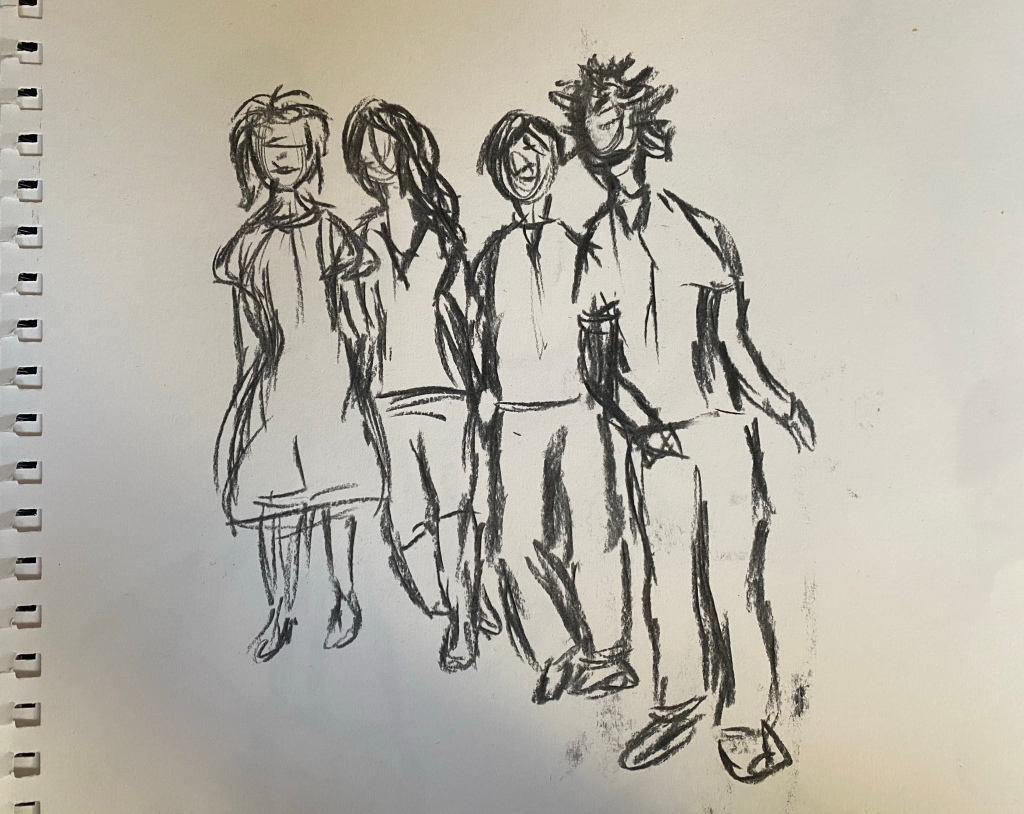
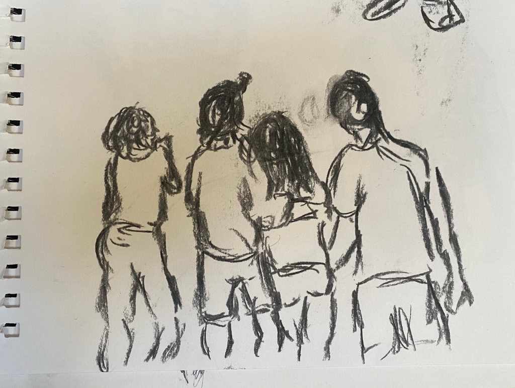
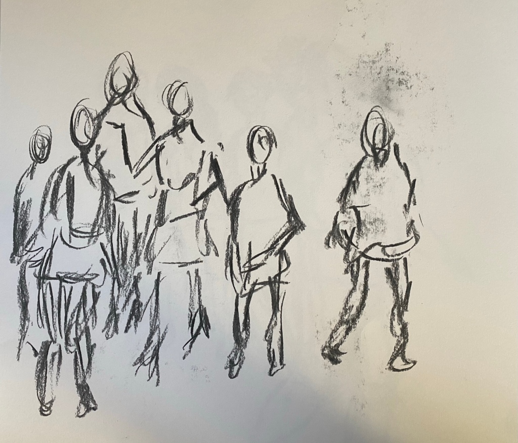
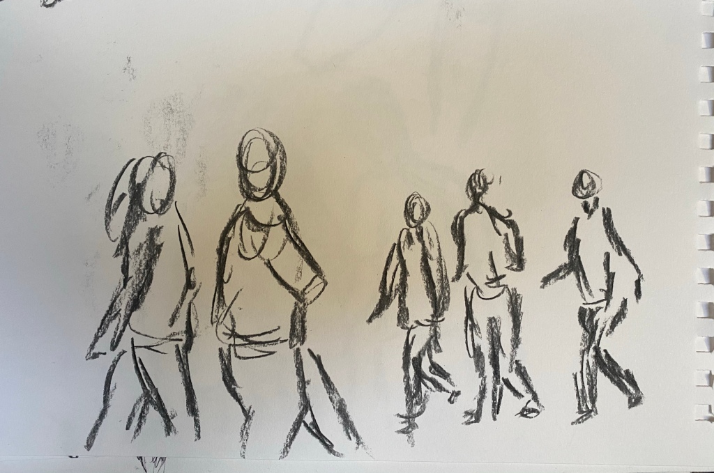
I took to my local park to sketch some groups of people. This was a tricky task as I had to work quickly and, also, without said people spotting me watching and drawing them. I had with me my sketch book and a couple of charcoal sticks, so, as the brief suggests, I wasn’t able to recapture colour, but I’ve had a whirl at the other parts.

I found this task really interesting, and, although they are quick works, I really like the way they look.

I think you are able to see the friendships, the enjoyment, and the excitement in these, especially the first two. The closeness and the positioning of those within the groups shows the companionship and I feel, when I look at them, that you are able to feel the happiness within them. The arms around each other, the way the bodies lean towards one another, the hands clasped to mouths or holding onto others shows the love and friendship that is there.

The other two sketches were small groups or pairings passing each other; not necessarily together, but close in proximity. Sketch 3 is of a crowd of people. I don’t think any of these people actually knew each other, however, the closeness of the crowd gives the impression that they do. Not exactly in the same way as sketch 1 and 2, but I think there’s something in common with them all. They’re all moving, they’re all on their way somewhere, and the sweeping, swift charcoal strokes seem to merge the 5 figures into 1. It’s only the single figure moving away from the group that doesn’t seem to be a part of this group, as though they are moving in another direction.

The final sketch shows two groups moving towards each other, but in opposite directions. The size of the figures and the distance between these two groups makes it very clear that they are not together, but you can feel the connection between those in the two separate groups. I don’t know what exactly portrays this; maybe the way the heads are positioned, turned towards each other, or the similar movements of the bodies.

It’s tricky to portray groups of people in a live setting, as their movements and positions change rapidly. It might be beneficial to take photographs of these groups to capture the scene you’re looking at before the group/person moves away, but I found that drawing there and then felt better, more natural. It was challenging, and to portray these people and their movements I had to work extraordinarily fast, which is why I think a photograph would be more beneficial to work from, even if that natural “there and then” quality is lost.

That said, although all of these sketches were created in a minute or less, I still think they’re powerful and my point has been effectively made. You can see and feel the movement, the emotion and the relationships between the figures, which is what I wanted to portray.


Single Moving Figure

Coursework

I’m seriously enjoying this part of the course, as I have mentioned about one hundred times. I have really surprised myself by showing skill that I didn’t even know I had when it comes to drawing the human form.

It’s been really interesting experimenting with the moving figure, finding ways to portray movement and to give life to something that doesn’t move. I’ve decided to jump out of the box and go down a route that I’ve been pretty reluctant to up until now. I want to add more and more of my own style into my work, and I’m starting to do that a bit more now that I’ve gained some confidence within my work.

In my head I think I have convinced myself that the brief is strict and that I’m not able to bend the rules, however, this isn’t the case. My tutor has advised me that the brief is simply a guideline and to branch out, which I have.

I sketched these from images online, and I’m really pleased with all of them, each for their own reasons.

The sketches display movement at very different levels; some moving quickly, some moving barely at all, but all of the figures partaking in something active. I originally sketched them in black ballpoint pen and was satisfied with the drawings. I felt like it was clear that the figures were moving, however, I didn’t feel that I’d truly captured that movement within the sketches. It didn’t feel like they were physically moving and I wanted that. I wanted them to be moving upon the page and not just drawings of people that were moving. I wanted them to still be moving.

I sat and pondered for a little while and then thought back to the previous task where I had used charcoal to draw (which I absolutely loveddddd). I wondered, could I add some charcoal? What would that do? So…

I used the charcoal to display movement in different ways, exaggerating the motion of each person.
For the first figure, I swept light charcoal markings behind her to show the movement of her walking. This seems to add speed to her, turning a simple stroll to a power walk. I was thrilled at the outcome. It was so brilliant to see that my decision to add simple sweeps of charcoal accentuated the movement further and really brought what I had drawn to life.

I then added some sweeping circular lines around the curvature of the next figures body, to really highlight the direction that her body is moving in. The figure is holding a yoga pose, twisting her body. I simply looped lines around the twists and turns of her torso and legs which seemed to, somehow, give the impression that she was not just holding that pose, but maybe transitioning from one pose to another. Super interesting how such a simple technique as this can cause such an impact.

The next, and maybe my favourite and most abstract, is the jumping figure.
I didn’t spend as much time on this one, and wasn’t as particular with the tonal range and bodily features. What I wanted to achieve with this one was complete movement, and in a way that I wouldn’t usually. I’ve sketched out the main figure, and I have then added an overlapping shadow of a previous (or future) movement. I think this is a really effective, if unusual, strategy in portraying movement, and, I have to say, whilst uncomplicated, it’s very impactful and, in my opinion, the strongest of the four.

The last sketch is the one that portrays the least movement. The figure is preparing for a sprint at the start of the track, therefore, there is not much motion. This is a strong sketch, but not a strong depiction of movement. If I had sketched this figure a minute or so later, whilst he was mid-sprint perhaps, it would have been a more successful movement piece. Still, I’m happy that I drew this one as it’s shown me how far I have come in creating the human form. Also how difficult, and important, the portrayal of action/motion within a piece is. Looking at this particular sketch next to the other three is fascinating. After the addition of charcoal on the other three, this one now looks very flat and a little dull. Previously, I thought this was the best of the four, but now, looking at the contrast, I feel differently towards it.

An interesting and eye-opening task!


Three Figure Drawings

Coursework

For this task, I drew a friend. It was the first model – nude or clothed – that I have drawn other than myself and my partner so it was a little daunting, but a really interesting task and one that I thoroughly enjoyed.

I began by creating some quick sketches of the model in different positions, gauging the measurements of her body parts and the distance between one and another part. I only created a few of these, because after a while I felt that I was ready and, also, I just wanted to get stuck in.

I found creating these preliminary drawings a little tedious. They’re rubbish, in my opinion.
I know that they are used to help me create the bigger picture, however, I found that 2-minutes wasn’t enough time to truly depict what I was seeing in front of me. I had to fight an overwhelming urge to just ignore the 2-minute rule and continue adapting and building upon these. In the end I wanted to just get stuck into the main part of the task, and I felt that the preliminary sketches weren’t benefiting me, but just irritating me. It was good to be able to quickly gauge the general length of her body parts and to quickly slot them together, but after just one or two, I felt that I was done and able to move on.

So, after creating a few sketches I decided to move on to the main part of the task:
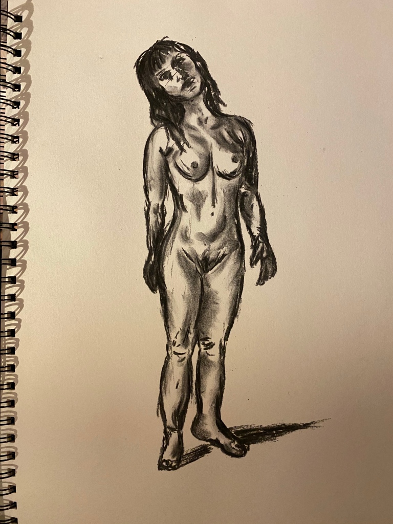
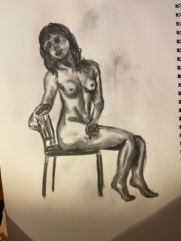
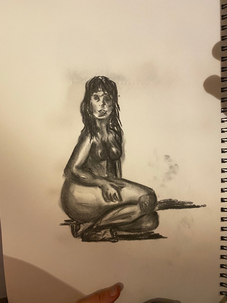
Creating three sketches of the model in different positions – standing, seated, lounging.

I chose to use charcoal for this task because 1) I am yet to use this particular medium to draw the human body, and 2) I wanted to experiment with the movability and density of the charcoal.

I am suuuuuuuper proud of these sketch.
I admit, there are areas that need improvement and areas that I don’t love, but I am so pleased with my progress.

My favourite of the three pieces is the middle one. I love the casual, candid positioning of the model, and I think I made managed to capture her really well. She looks relaxed, at ease, and comfortable with her appearance. When drawing a human being I think it’s important to capture their feeling and emotion within a piece, and this can be tricky when we’re focusing on so many features at once. In this piece, I think I’ve managed it.

One thing that I think I’ve done really well is depicting the texture and tone of the body. You’re able to see the dips and twists and folds of the body through my use of shading, especially in the second piece. The model is sitting on a chair, but is twisted towards me, and you can see this by the positioning and the direction/depth of charcoal on her body. She looks 3-dimensional, which is another thing I’m really chuffed with. Before, I struggled to lift many of my drawings out of the page, however, I’m developing real skill in bringing my sketches to life through the use of tone. Hallelujah!

I’ll be honest, I think I still have a way to go with nailing the proportion of a model/object when drawing it. There are some, if only slight, areas of these drawings that don’t look quite right and would look much better if worked upon. For example, the first sketch of the standing model: I believe that her legs are ever so slightly too short. I’m not sure if this is due to my viewpoint, but it doesn’t look quite right on paper. It’s not a great tragedy and I’m still confident in my work, but it’s just something to be mindful of in the future. Also, facial features, hands, and feet. These are all areas that I find really challenging. They always seem to come out a bit weird. I’ve noticed that when I focus on them on a large scale, I am able to depict them accurately and I surprised myself in a previous exercise where we were asked to focus on individual body parts and I created some really effective sketches of hands and feet, however, when it comes to adding them to a sketch of the full body, they’re very tricky.

I think I went a little overboard with the final sketch. I returned to a previous experiment that we focused on within this piece, as I had to practice the technique of foreshortening. Her feet were the closest part of her to me, and, whilst I think I’ve done a fairly good job of portraying this accurately, it still looks a little odd. I also think I went a little too far with the shading. Much more of her body was shaded due to her folded up position, however, I think I could have eased back just a little, especially around her breasts and her feet.

Imagining the skeleton and muscles of the body didn’t help me much. If anything, I found it a bit confusing. I have opted for combining a few of the previous techniques when creating the human form now, and I find it so useful. Instead of drawing the general shapes of the body parts and the central axis separately, I’ve began drawing lines in the areas and of the general length of the part that I will be drawing the parts: a loosely drawn circle for a head, neck, torso, upper and lower arms, hands, upper and lower legs, feet. This helps greatly as a guideline for a sketch and with the proportion of my piece.


Historic and Contemporary Artists’ use of the Body’s Underlying Structure

Coursework

I was very excited approaching this research point, as I am seriously enjoying exploring the human form and all to do with it. It’s been brilliant so far, and I’m keen to gain some inspiration and tips from other artists that focus on recreating the human form. I much prefer contemporary art to historic art, so I’m particularly interested to see what kind of contemporary artworks I can find in this task.

Fig 1 – Domenico del Barbiere; Two Flayed Men and Their Skeletons (ca. 1540–45)

I began with this piece by Domenico del Barbiere, a sculptor and engraver from Florence.
The engraving may reproduce a composition by Rosso Fiorentino (1494–1540), who may have planned it for a book on anatomy. Domenico, however, has signed his own name only (at the extreme left), and some scholars have suggested that the design is his own invention.

The engraving depicts two skeletons, each with a flayed man, standing in the similar positions, shown from the front and the back. The detail and accuracy of the human anatomy within this piece is phenomenal. There are so many features of this piece that you could miss at a first glance. For example, when you study the piece further you notice that the bodies are, seemingly, addressing each other, as though in conversation.

I find this piece completely fascinating. I’ve never seen anything else like it and it’s more detailed and striking than I imagined a piece from this time era could be. To think something as brilliant as this has been amongst us for thousands of years is captivating. It’s artwork such as this that has taught us so much about biology and the human anatomy, which makes it all the more special.

Fig 2 – Nicolas Henri Jacob, 1831

Between 1831 and 1854, the French anatomist Jean-Marc Bourgery and his compatriot Nicolas-Henri Jacob, a versatile artist, produced a richly illustrated and ground-breaking medical textbook.

This, like the previous piece, is unlike anything I have seen before. It’s really interesting to see the human anatomy displayed in such a way. Jacob created his work using paint, which is a form of media that I am keen to experiment with at some point in this part of the course. Looking at the brilliant range in colour/tone and the extraordinarily fine details the artist has achieved using paints has inspired me even further.

Fig 3 – Loïs Mailou Jones, “La Baker,” 1977

Next, I looked at the piece above by Loïs Mailou Jones, a vibrant and unique painting.

Jones produced many paintings, drawings and textile designs in the context of the Harlem Renaissance.

At a time when racial and gender prejudices pervaded society, she was capable of producing oil paintings imbued with brilliant and lush colors, rich patterns and references to Haitian and African culture. Her strong design sense and inspired vivid acrylic and watercolor paintings were proof of the talent of black artists even if her fondest wish was to be known as an artist, without further labels.

I love, love, love the use of strong colour and the incorporation of black lifestyle and themes. It’s beautiful and, again, it has inspired me to experiment with paints, and bold ones at that!

Fig 4 – Egon Schiele, Rückenakt mit orangefarbenen Strümpfen (early 1900s)

Egon Schiele developed an obsessive exploration of the human body, and wasn’t one to shy away from displaying it in all it’s glory. Genitalia, male and female, sex and masturbation was (and still is) a taboo subject, however, he explored it unashamedly which I find really inspiring. The confidence that Schiele had to explore the human body in this particular way is wonderful. It’s shocking, absolutely, but I doubt he would have been half as successful as he was if his pieces hadn’t been.

You’ll notice that as we move forward in time, and the gap closes between the now and then, that realism and the accuracy of form becomes more and more weird and wonderful. This is something that I really, really enjoy about contemporary art; much of it is very abstract, pretty strange and, at times, risqué.

I feel more confident working in styles similar to that of many contemporary artists. I find the modern depiction of the human form far more interesting than most historical depictions. I feel that artists have become far more confident in portraying their true self through their artwork, and guidelines just don’t really seem to exist these days. I also feel that, in modern art, the body is celebrated for what it is, instead of inspected and scrutinised for scientific purposes.

Fig 5 – DAISY COLLINGRIDGE, Quilted Body Suits (2010s)

London-based textile artist graduated from Central Saint Martins with a degree in fashion design, however, her creations aren’t something you’d see worn out on the streets. Her practice revolves around revolves around fabric manipulation and crosses into the realms of sculpture and performance.

The creations take lead from real human anatomy, with Collingridge then extending body parts such as boobs, stomach, and muscle systems into overlapping, squishy shapes. I’m reminded of duvets and/or pillows when I look at these creations. They’re bizarre and even a little terrifying, but they’re interesting, that’s for sure!

This depiction of the human body is distinctive and you’d immediately be able to pin the artist on the creation if you were to see it anywhere. I really like the originality and the creativity used to form these ‘suits’. The colours and the shapes used are accurate to that of the human anatomy, and, unlike most artists, Collingridge portrays the human form in a very unflattering and unusual way. For a start, all of her productions replicate obesity, which is something you rarely see in art.

Fig 6 – Nychos, Dissection of Marilyn (2016)

Finally, I looked at this piece by Nychos, created in 2016.

Nychos is an Austrian artist, currently based in Vienna. He began creating street art at the age of fifteen and established Rabbit Eye Movement (REM) in 2004, an art concept that transformed into a gallery space and agency dedicated to connecting networks of artists.

His pieces are created using acrylic on canvas, and they are quite something.

He is recognised for his exceptional anatomical imagery. His large-scale murals of translucent and dissected characters can be seen all around the globe. Deeply rooted in Graffiti and Street Art and shaped by pop-cultural influences, NYCHOS creates murals, fine art, illustrations and sculptures.

I just love this piece. It’s incredible. Odd, extraordinary and slightly disgusting. It’s very surreal to see one of the most famous actresses to ever exist depicted in such a crude manner.


References:

https://www.metmuseum.org/art/collection/search/358117

https://www.pinterest.co.uk/pin/555842778981637191/

https://arthistoryproject.com/artists/lois-mailou-jones/la-baker/

http://www.artnet.com/artists/egon-schiele/r%C3%BCckenakt-mit-orangefarbenen-str%C3%BCmpfen-colored-by-PDlnpnlz4MV__UgctIRQ4w2

https://www.thisiscolossal.com/2020/01/squishy-textile-flesh-suits-by-daisy-collingridge/

https://www.vice.com/en/article/mgpdxq/gory-anatomical-portraits-nychos


The Structure of the Human Body

Coursework

For this task we were asked to loosely sketch some of the structures that make up the human body. I mostly used images from the internet for this task, and worked quickly but accurately through the sketches.

I have worked predominantly in pencil through this part of the course, so I decided to branch out a bit and work with something a bit more permanent – a black ball point pen.

I found that, whilst working through these, I was focusing mainly on the shadowing and range of tone upon the body parts; where the muscles dip and rise, where the skin folds, where body parts met or blocked the light, and the joints of the limbs.

I really loved this task. I found it extremely enjoyable and I was ecstatic when I realised that I had made a huge amount of progress in my depiction of the human form. Even my partner pointed it out to me, which completely made my day! Approaching this area of the course, I was anxious and unsure of myself, but I can see that I have come a long way and my creative technique is shining through. Hallelujah!

If I were to choose a few favourites of the selection above, I would have to say that I am most proud of the neck, the first sketch of the foot, and the hand. The foot and hand are areas of the body that I have always, always had serious issues with. I’ve found them extraordinarily challenging to draw in the past, and have often become very frustrated with the process or just given up totally. There were even points during these sketches where I thought I’d spoiled it or that it looked ridiculous, but with persistence, resilience and some tweaking, I got there! And I am so chuffed with the outcome.

I mean, don’t get me wrong, I definitely see room for improvement. My work is by no means perfect, and there’s a lot more work needed, but, for now and for the short amount of time that I have been working on drawings of the human form, I think I’m doing pretty well.

Areas that i can see do need improvement are legs and the depiction of movement and shape. I think I’ve done an alright job with the legs that I have drawn here, however, they could be a lot better. They could look more leg-ish and more realistic. I was very aware that I could at some point go too far and have completely ruined the sketch, which is something I have done many times before and something that me and my tutor have discussed. I’ve got to the point where I’ve become happy with imperfection and leaving something as it is, and accepting that is the best that I can do at that time. I feel this way with the legs and, slightly, with the arms. The issue that I find is the drawing of a close-up body part of limb. From a distance, I feel confident and sure of my ability to depict these things, however, it’s the finer, more specific details that I am having some trouble with; muscles, texture, shape.