For this task we were asked to sketch our model in a ‘dynamic’ position.
I’m currently not able to use a live model, so I had to take to google search to find images of models moving – e.g. dancing, running, exercising. I worked in thick graphite pencil for this; it’s more dense than standard HB pencil, but not as thick and chalky as charcoal.
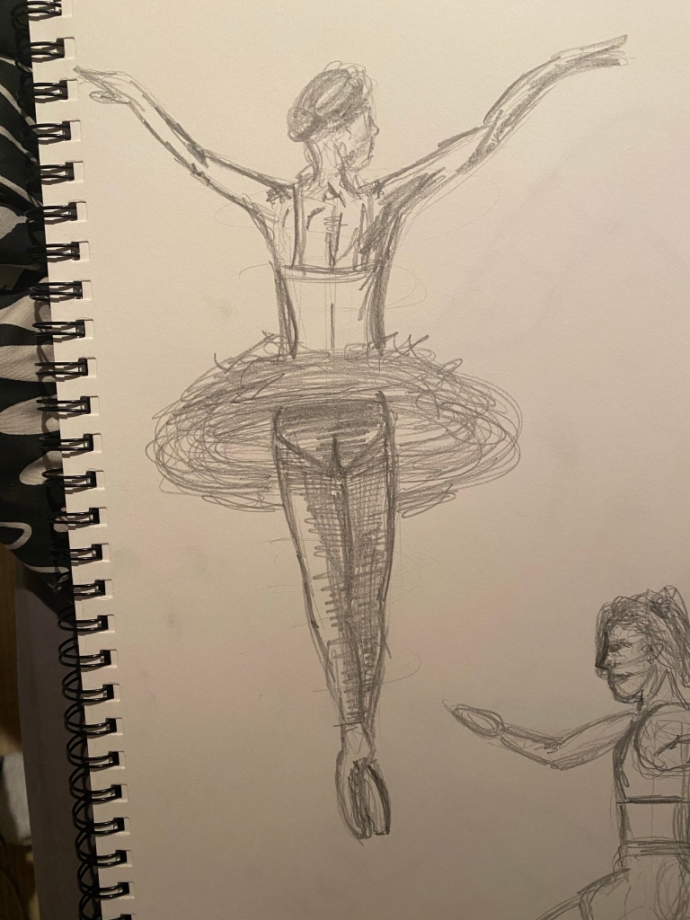
Sketch 1
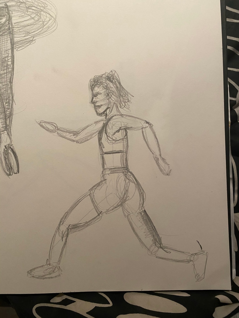
Sketch 2
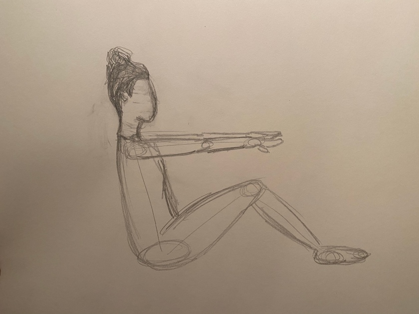
Sketch 3
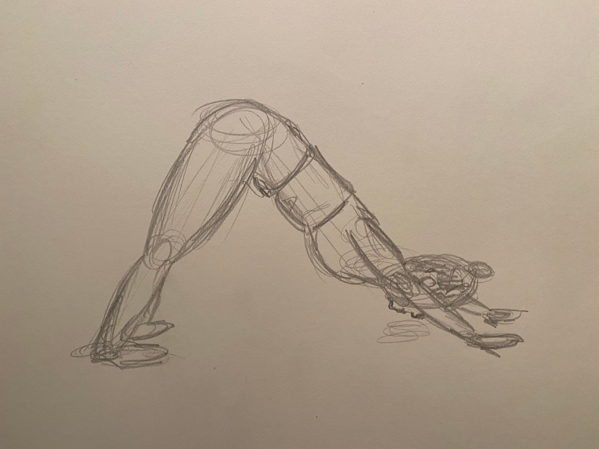
Sketch 4
The sketch that I believe to be the most successful, and the one that i enjoy looking at the most, is sketch 4. The positioning in regards to the hands and feet is a little off, but the overall structure and appearance of movement within the sketch is clear I think.
I like the appearance of sketch 1, however, I think I went a little overboard. I used the clothing of the model to display the movement (the circular, spinning motion of the dancer is portrayed through the skirts). I think this particular piece would have been far more impactful if more time were spent creating it.
Sketch 2 is another that I’m feeling really chuffed with. The image was of a woman running and jumping between two rocks on a cliff. I think I have displayed her movements really well. The movement is clear through her entire body; the twist in her back and the angles/positioning of her arms and legs don’t look at all natural as they would if she were just standing, which makes it very clear she is in movement.
I’ll admit, I have slightly misjudged some of the bodily proportions, however, for a few 5-minute sketches and my first real attempt at depicting movement, I’m pleased!
Looking for the centre of gravity within the figure, we were asked to draw a range of positions of a standing figure. My partner took images of me standing, moving slightly every time he took a photo.
Overall, I’m pleased with the outcome of these. Not as much as I was with the sketches from the previous task, but I worked far quicker on these. The scaling is a little off on some of these, and I struggled with the poses that were a bit ‘wonky’ or unusual for me.
Something that, I think, needs some work is the weight bearing aspect. It’s clear which leg is bearing the weight in the sketches where it’s relevant, but that’s just because, as a human being, you’re familiar with these poses. I think I could make it clearer through the use of tone, however, in the few minutes I allotted myself to draw each pose, I didn’t have time for this.
In some, I think the torso is a bit too long, however, I’ve just looked at my body in a mirror, and part of me thinks it’s the positioning of the shorts and the bra. That being said, I’ve made a mental note to be aware of this in the future. I’m a tall person and have very long body parts, but something doesn’t look right here.
Another fault that I can see in most of these pieces is the structure and layout of the face and head. I find that my ability to depict the head and face is very hit and miss. Here, I think it’s mostly miss. Again, I feel that this has much to do with the fact that these sketches were made very quickly, with not much time for alteration or consideration.
My favourite of the sketches above is the side profile – sketch 3. I think I’ve depicted an accurate representation of my body side-on, and I think the scale and proportion is fairly spot on.
Using a centre of gravity line is really useful, and something that I’ll take with me into all my future tasks around the human form. It’s a great start point for drawing the human body, and has completely transformed the way that I draw people!
Rework:
I decided to re-approach my least successful few of the sketches above and give them another whirl. This time around, I feel far better and I am satisfied that I’ve had far more success in them.
Granted, some of the facial features are still not there, and there is still much area for improvement, but I’m way more happy with these than the previous versions of them. Using basic shapes and centres of gravity together was super useful in creating a more accurate form. As you can see clearly in the last sketch, I used balls for the joints and head, rectangles for the body and arm/leg parts. This worked wonders and I can see huge improvement from the first attempt to this one.
Now, I’m feeling much more at ease regarding this task. I was slightly uneasy about the outcome of the first selection of sketches, but now I have returned to the task and given it another go, I’m satisfied with what I’ve produced.
For this task we were asked to draw a sequence of six different poses lasting ten minutes each. I wasn’t able to access a model at this point, so I searched for models online to sketch. I chose six images where the positioning of the lighting upon the model varied, and, also the poses that the models were holding.
Sketch 1
Sketch 2
Sketch 3
Sketch 4
Sketch 5
Sketch 6
I’m super pleased with the outcome of these six sketches.
I think I’ve made some slight errors in proportion over a couple of the sketches. There are also some areas of the body that I’ve misjudged regarding the curvature of the body, either overdoing it or underdoing it; however, I am pleased with how these have turned out considering this is my first time sketching the naked or near-naked form.
I think these are fairly strong sketches and I’m feeling really proud of the progress I’ve made. If I had to choose a favourite of the 6, it would be sketch 3. I love the positioning of the model and found it a really interesting image to recreate. I think I’ve depicted the human body best in this piece, and the hatching techniques I’ve used to form the darker tones upon the body looks really effective.
Once again, I can see the benefits of working quickly; less time to think and worry about imperfections. Working quickly and with pencil, I was able to speedily add lines and work upon them, adding and editing as I sketched. If an area needed work, I found that, rather than use an eraser to remove them, sketching over them and adapting the sketch that way was more successful and looked far better.
Were you able to maintain a focus on proportion at the same time as creating a sense of weight and three-dimensional form?
I think I’ve accurately accomplished this.
I can see, specifically, in sketch 3, 4 and 5 that the proportion of the figures is accurate, and, at the same time, I’ve managed to maintain a sense of weight and three-dimensionality. These figures don’t seem flat against the page; I think I have managed to achieve this through the use of tone and the curvature of my lines. For example, in sketch 5, curving the lines around the shape of the breasts and around the thighs has achieved a sense of realism and the figure seems to rise out of the page that bit more. Small areas of shadow really transform a piece, so I made a conscious effort to locate all areas of tone, and add them all.
Which drawing gives the best sense of the pose and why?
I think sketch 3 gives the best sense of the pose. It’s a really interesting pose and one that I found challenging to depict, but one that is really impactful. It’s not just a person standing there, and the light upon the model really accentuates the curves of the body. Adding tone to a figure when sketching is really important creating a three-dimensional effect, and this was the perfect piece for that.
I particularly love the way the model’s legs look. As she is crouched on the ground, her legs folded and parted, the perspective/proportion was a little unusual. On the left leg, the thigh is barely even visible, which was tricky to portray, but I think I’ve managed to do a pretty good job. Her head is tilted upwards, as though she’s looking up to the sky; another area that I was worried I wouldn’t be able to accurately depict, but, again, I’m thrilled with how it turned out. This particular pose was one that I was anxious about, but I think it’s turned out pretty well.
Was there any movement or gesture away from the model’s central axis? If so did you manage to identify this and put it into your drawing?
In pretty much every single sketch there is some kind of movement or direction away from the central axis. I chose to add horizontal or vertical axis lines away from the central axis, as I’ve found this technique useful in previous tasks, and it worked really well in this task. Adding these lines also helped me massively in portraying accurate perspective, as I could use them as rough measurements of the torso and limbs.
For this task, I began by sitting in front of a mirror, and drawing my reflection as I saw it. Foreshortening wasn’t something I had really thought about before, however, when focusing on it, it becomes very obvious. My foot that was closest to the mirror was far larger than the parts of my body that were further away, such as my torso and my head.
I thought depicting this in a sketch would be challenging, however, it really wasn’t. I completed this task after I had began the third project in this section of the course, so I have already completed Basic Shapes. I used this new strategy to help me in mapping out the general form of my body, and it was a huge support.
For a first attempt, I am so pleased with how it turned out. I think I’ve portrayed the proportions of my body accurately and believe it to be a realistic depiction of what I was looking at in the mirror. Of course, I had my sketchbook propped up against my leg, however, I would move this out of the frame when sketching my arms and body parts that were blocked by the sketchbook.
After completing this task, I’m filled with confidence and feel far more ambitious than I have previously. I can see definite improvements in my work already, after only a few exercises.
Foreshortening is a technique used in perspective to create the illusion of an object receding strongly into the distance or background. The illusion is created by the object appearing shorter than it is in reality, making it seem compressed.
The technique became popular in the Renaissance period and has been used ever since. The first example that I discovered was The Lamentation over the Dead Christ, which dates back to 1490.
The body of Christ looks a little bizarre, as though he’s been squished from the top and bottom end, but when you look deeper you can see it for what it truly is. I find it a little odd that his feet don’t look ginormous, but can’t quite put my finger on why this is. Regardless, this piece is remarkable and wonderfully realistic. There are so many features that you might miss at first glance, but eventually, they jump out at you – the holes in the hands and feet, the crying faces to the left, the pale pallor of the body.
The perspective that this is painted from is from the bottom end of the body, but slightly elevated; this adds some length to the body. If the perspective had been from a lower point of view, I’m sure much of the body would have been hidden by the enormous feet taking up most of the view.
Here are some more examples I found of foreshortening.
It’s really interesting to see different artist’s takes on foreshortening when it comes to the human body. I love how dramatic they seem, as though you (as the viewer) are a just a tiny little thing viewing something enormous and wonderful from your small position in the world. No matter the size or positioning of the subject being drawn, it still seems extraordinarily large. From the perspective taken to achieve foreshortening, certain body parts or areas of the body will always appear far larger than others, and far larger than they would normally.
These pieces of work differ hugely from each other, and for a number of reasons. What they all have in common is the perspective and approach taken to create them. However, each piece has some of the artist’s personality bursting out of it. They have styles and features that are so unlike each other, and this is what makes them so appealing to me. Whilst they are all sketches of bodies and all drawn from roughly the same (or similar) angles, the style of each is hugely different. This just goes to show that there are no limits to what you’re able to create when working with the human body. Yes, there will be similarities to other pieces, but there are no boundaries.
I love the first two pieces because of how dramatic they are, specifically the second. The details on the feet are extreme and well defined. You find that your eye is drawn from the feet and up the leg, towards the rest of the body hiding behind them. The feet and calves dominate the piece, and the tones used to depict the skin colour and texture give the person the appearance of bruising or uncleanliness. I find this painting so moving and I feel exceptionally sad for the person within it. From my perspective, they seems as though they’re stuck inside a very small space. They seem vulnerable, and I think the perspective it’s painted from accentuates this hugely, as does the use of dark, bruise-like tones. This piece goes to show just how powerful perspective can be, and how important it is to consider. Of course, I don’t know for sure, but I like to think that the artist chose this perspective for a distinct and very important reason; to make the painting as powerful and poignant as it is.
However, my favourite of the selection is the fourth image, created using what looks like pastels and/or chalks. I really like how the artist has formed the body using strong lines. These lines accentuate the contours and curves of the body. The thighs, breasts, dips and arcs of the subject are formed beautifully but subtly using chalk strokes. I think I love this piece so much as it’s something that I could create myself. It’s not at all intricate or spellbinding, but it’s interesting and, to me, extremely beautiful.
The subjects in both pieces discussed are vulnerable, but in an entirely different way. Both subjects are naked, but depicted in completely different ways. In this one, the subject is positioned provocatively and it seems as though her naked form is there to be admired and celebrated, but, in the previous image, I felt that the person was weak and exposed, hiding their body, and not without clothes by choice. It felt uncomfortable to witness, however, this one seems exciting and something to enjoy.
I don’t own any chalk right now, but, after seeing this piece of art, I’d be extremely keen to get my hands on some to see what I could create using some. It’s always hugely inspiring to view the work of other artists, because it reminds me that I need to be myself, to put some of myself into my work, and whilst I’m following guidelines in my work, that’s all they are; guidelines, NOT rules.
For this task we were asked to draw a model in a seated position, at a slight angle.
To begin with we were to consider the ventral axis that runs through them in their position and to recognise any twists or bends. I chose to quickly map out these angles and directions in line with a pencil and work from there.
Surprisingly, this task was simple. I was expecting it to be tricky and was concerned that I wouldn’t be able to accurately portray to human form through the use of shape. However, it turned out pretty well.
I made three sketches of my partner and each time moved his position, and even switched up the chair that he sat in each time to see what differences this made to his positioning and my drawings.
After mapping out the general shapes of the body, I went over those shapes to give more structure to the body and to add slight features to it.
The body is largely made up of rectangular shapes and ovals.
The torso, the arm and leg parts are rectangular in shape. The joints and head are ovals.
It’s extraordinarily simple to form the human body using these simple shapes. I found it wasn’t a challenge at all, which is something I was nervous about when approaching this task.
My favourite of the three is the drawing on the left hand side. As the model is leaning on his elbow upon the arm of the chair, his body is tilted slightly to the left. Even more so because his left leg is folded up onto his right. I like the way the form looks sitting on the chair, leaning on his elbow. Somehow, without much effort, I’ve managed to depict a casual and relaxed feel with this sketch, and I’m really pleased about that. It just goes to show that facial features and defined details aren’t exactly what makes a sketch what it is, as I’ve achieved this without either.
The proportion of the model in these sketches are fairly accurate, I would say. I think I’ve managed to accurately depict my partners body using basic shapes, whilst maintaining pretty realistic body proportion.
I worked further on the first preliminary sketch, as it was my favourite of the three.
I think, for a first attempt at a full body sketch, created using basic shapes, I’ve done pretty well.
The torso looks slightly too long (or maybe the legs are too short), however, I’m not sure whether it’s just the positioning of the model and my point of view. I think sometimes it’s necessary to tweak drawings such as this. Sometimes, even if the model does look a certain way, I have needed to alter proportions to make the sketch look accurate and more realistic.
It’s really amazed me to think that this sketch, as simple as it may be, started from just basic shapes. Working upon those shapes in pencil, layering the lines and such, pretty much eradicated all the original lines I drew. I’m no longer able to really see the axis lines or the basic shapes that this sketch started as, which is fascinating. I’m literally sat here thinking, where the hell have they gone?! But they’re there somewhere, beneath all the work.
I’m enjoying this part of the course far more than I thought I would, and I’m excited to adapt my skills further and compare the outcome of my journey at the end of this section to what I was creating at the start.
For this task I focused, again, on my partner playing on his games console. I found this one a lot tricker than the quick studies. I think that’s because, when I work slower, I’m more conscious of my decisions and the lines that I make. My partner sat in the same position, wearing a similar item of clothing – long sleeved, soft material that shows off creases and folds.
I attempted this piece in pencil. In the quick studies, I preferred the charcoal sketches that I created, however, I wanted to see what I could attempt with a pencil, working at a slower pace.
I began my adding small marks to map out the general proportion and areas of the body parts – the top of the head, the shoulders, and other areas that I felt were crucial to map in.
I then worked from the middle of the body, towards the head and then towards the legs. When I was a little girl, bizarrely, I used to draw my people from the feet upwards. My parents always tried to encourage me to draw them from the head, and then work from there, so to actually be told to work from the middle is interesting and a little funny. But it works!
There’s something about this that just doesn’t sit right with me.
Overall, baring in mind this is my second attempt at drawing a human being, I think I’ve done a fair job. I’m pleased with how the hands turned out (this was an area that I struggled with), and the overall proportion of the subject on the paper. I had to tweak a few times as at points the size of things didn’t quite look right, but I think, for now, I’m doing alright.
There are definitely areas that I need to work on such as facial features and specific body parts like hands and what-not, but the clothed figure is going well so far.
After the pencil drawing, I was about to finish for the day. I’d spent an hour, maybe a little longer, on it and didn’t want to go too far and end up losing my mind. But then I thought, what would it look like if I accentuated features of it with charcoal?
The answer is – pretty cool. I’m glad I made the decision to go over the sketch with charcoal. Now, it seems more interesting and it’s something I enjoy looking at more. Yes, it’s not perfect and there’s features that are a bit odd or just not right, but I’m satisfied with my choices and the progress being made.
My tutor has strongly advised me to make a piece my own, which I’m really trying to do. I wanted parts of this piece to look a bit odd and a bit abstract or incomplete because I think it adds interest to the piece, and I think I have managed to achieve that. I was discussing this piece with my partner afterwards and he says that he feels that I’ve managed to capture him perfectly whilst he’s playing. He says that you can see the concentration there but also the playfulness and excitement that a person experiences when they’re playing a video game. I hadn’t even really considered this but now that he’s pointed it out, I can really see it.
For the first part of this exercise I worked in both HB pencil and charcoal.
I was pretty nervous leading up to this task as drawing the human form is way out of my comfort zone, but I am pleasantly surprised with the result. Simply drawing quickly and drawing vague lines based on what I was seeing in front of me was a really simple but useful little technique.
My partner was sat, playing on his XBOX and I just quickly began to scribble him into my sketchbook. It’s funny what you can come up with in only 2 minutes, and with a task such as this, it’s important to work quickly and in a pretty vague manner. There’s no way I would’ve been able to achieve great detail in only 120 seconds, but I love the outcome of these preliminary drawings.
I followed the guidance of the text which advised me to work from the middle and not to use outline, which is something I have heavily relied on in the past. Simply scrawling with my pencil or charcoal and barely even glancing at the page in front of me worked really well; I just quickly dashed in the lines in the general areas as my hand followed my eye-line and this is what I got.
Ten Minute Studies
These are the two pieces that I created for the ten minute studies; taking ten minutes for each piece. I worked in charcoal for one and HB pencil for the other.
I showed my partner these and asked which he preferred and he advised me that, whilst he thought both were fab, he really liked the one on the left as he loved the appearance of the charcoal. He said that he thinks there is something dark and quite menacing about it, which drew him in.
I think both of these pieces are really successful, and I think they’re both very different from each other. You may not even know that they were created by the some person, which I really like. I feel that different aspects of my personality show through each piece. For example, with the charcoal piece I think it shows more of my outward personality – a bit chaotic, a bit mysterious, and extremely wild. I loved using the charcoal to create this piece; it’s such a fun and versatile material and it works beautifully when creating portraits and sketches such as this – and especially when you’re working speedily.
The piece on the right shows my perfection to detail, and the more relaxed, controlled side of me. I suffer from ADHD so these moments of chill are far and few between, but they’re definitely there.
I really enjoyed working with the pencil on this piece as it gives the sketch a subtler, softer appearance, which best reflects the person I was drawing. My partner is very lovely and very gentle, so charcoal doesn’t suit him, in my opinion. Before, I would never have thought that the type of material used to create a piece of art could be reflective of the subject within that piece, but I guess I knew that deep down.
I really enjoyed this task, and I’m so thrilled about that because I was worried that I would hate it. I’m so eager to see what’s next now. I understand that the pieces above are by no means perfect, but they’re far better than I even thought I would be able to achieve with such little experience in this area.
The earliest known portrayal of the naked female form in art is The Venus of Willendorf. This particular item dates from 28,000-25,000 BC.
This particular portrayal of the human body is just 11cm tall and was discovered just over 100 years ago during an archaeological excavation in Austria. This particular item was created using limestone and coloured with red ochre. It’s thought that items such as this were designed to be used as fertility symbols; items that brought luck to those trying to conceive, a mother goddess symbol.
These beliefs were caused by the very prominent features of the figure: the large breasts, the rounded stomach, and the shapely hips. However, no in is exactly sure what the exact purpose of these figures are.
David, created across three years by Michelangelo, is one of the most recognised and appreciated portrayals of the human body across the world. Dating back to the early 1500’s, this statue is created using a single block of Marble and stands at a staggering 5.16 metres.
It’s both frustrating and hilarious that the first image looked at focuses on a larger, unusually shaped female, yet the next one is the enormous and chiseled hunk that is David.
The story behind the statue of David is the well known Biblical story of David and Goliath: a teenager not at all equipped to defeat the enormous Goliath, David uses his cunning skill to defeat him using a slingshot.
The statue portrays confidence and I feel that Michelangelo has depicted David so enormously to represent this, as well as his pride and his determination. You can see the slingshot on his shoulder and the rock cradled in his hand; the weapons used to defeat Goliath.
I’m unsure as to why David is stark naked, however, the definition and accuracy of the male form on this statue is remarkable. It’s easy to forget that this is just that; a statue, and not an actual human being.
The contrast between this and the previous human form looked at is huge. It’s completely incredible to see how the depiction of the human form changed in that amount of time. The development in skill, equipment and tools must have changed enormously from the time of The Venus of Willendorf to that of David. We have also moved into a whole new purpose for creating the human body; beforehand, these items were designed to serve as luck and to bring success. Now, artists are using their creations to tell stories and to show important historical events.
The scene of Cranach’s Adam and Eve is set in a forest clearing where Eve stands before the Tree of Knowledge, caught in the act of handing an apple to a bewildered Adam. Entwined in the tree’s branches above, the serpent looks on as Adam succumbs to temptation.
Here we move away from the nude human form as a statue, and towards the use of colour upon surface.
The details within this piece are very finely painted and the use of colour and tone is gorgeous. Looking at the figures of Adam and Eve, as well as that of the animals surrounding them, I feel that their forms are accurately portrayed and extremely believable. Also, personally, I enjoy art far more when it’s colourful. I feel that it adds more life to the piece, and it’s during this era that we begin to move into a more colourful form of creativity; one in which stories are told through paintings. Like David, Adam and Eve is a depiction of a biblical story that we all know and love, and this version of it is so lovely.
Something that I find really interesting about this piece is the use of the fig leaf to protect their modesty. The leaf, as in many depictions of these scene, covers their genitals. In many statues and paintings from this era and before the full body is on show, and although you are able to see every other part of these bodies, I find something quite innocent and sweet about the fact that the leaves are covering their lower areas.
Moving forward in time, we enter an era where the human body in art was less of a religious symbol, and more of a portrayal of beauty. The human nude became less a story teller and more something to admire and celebrate, as you can see here in Olympia.
When this particular painting was first unveiled, viewers were shocked. Initially, not due to her lack of clothing, but because of her confidence and comfort at being painted in such a state. As you can maybe imagine, this was something not often favoured of women of high standing during the 19th century.
But what would viewers think of someone of a lower class in this state? The woman in this painting is, in fact, a prostitute. Something that Manet didn’t exactly keep a secret. So, rather than portraying a nude figure from the bible, as would very much be the convention at this time, Manet chose instead to paint a prostitute; elevating her to position of central importance in his picture.
I love that. It’s an extraordinarily risky shot, and one that shocked thousands of people, but something that put his name on the map. And, let’s be honest, it’s a gorgeous piece.
A female figure; beautiful and confident in her natural form.
I also read that the figure behind her is a maid, possibly delivering flowers from a lover. I think is accentuates her success in her field of work and gives her the air of royalty. Good on her and good on the painter. I think this is a remarkable piece with so much power within it. A truly shocking and memorable piece of work.
We’ve got there. We have arrived in the era where the human nude was used to create what we all know it best for – sex and sexuality.
I have never seen this piece before, and I have to admit, I think it’s fabulous. Man Ray’s Mr & Mrs Woodman, 1928.
Moving completely away from sculpture and painting, we now enter the era of the camera. Man Ray approached his depiction of the human nude in a very obscure and surreal way; creating risqué and playful photos of 2 small wooden mannequins engaging in sexual acts.
He is known for his Dadaist and Surrealist approach to art; challenging the norms of the creative world and engaging in a more spontaneous and shocking approach to his artwork.
Although still outrageous and something that would stun some viewers, the 20th century became a time were sex and the natural form became celebrated and was less something used to tell stories or blowing minds, but a thing that was appreciated by many. It even became something of inspiration.
Yes, there were, and still are, many people that would not admire or appreciate this form of artwork, but the 20th century was fast becoming a time where people were experimenting with their sexuality and taking more pride in their bodies and the way they could display them. Whilst we do still live in a world where things like this cause some to faint from shock, it’s artists such as Man Ray that have helped develop the art world into something a bit more interesting and fun.
Sticking with that same theme of celebrating the human form, we have Tom Wesselmann and his print of Monica Sitting With Mondrian, 1989.
Less shocking and less sexual, this print is one of my favourites. I love that the strength in detail lays solely in the structure of the female body. Her face is blank, apart from her lips, and parts of her are incomplete, such as the top of her head and her left arm. But her torso is where all the detail is.
This piece looks like it was created quickly, however, there’s something still really intriguing about it. It’s very 80s, which I love; the style and colour scheme of it is really gorgeous. The most interesting thing to me is that, whilst the piece is very linear and very basic, the figure within it is still extremely attractive. It makes no difference that she has no face and that parts of her body aren’t even drawn; she is beautiful and, as a woman myself, I find this portrayal of the female body really empowering.
Another thing that fascinates me is that the earliest pieces of art that depict the human form were basic, and then, as time progressed, we became more accurate and more specific in our detail, but now, contemporary artists have sort of said “sod it” and done whatever they feel like doing to create the naked form.
This particular piece fills me with inspiration and has eased many anxious thoughts that I had approaching this area of the course. I was really apprehensive about focusing on the human figure, but this piece has shown me that my creations don’t need to be perfect, they don’t need to be extraordinary.
This artist has injected so much of their own very specific style into this piece, which is something that I have been strongly encouraged to do by my tutor. It’s not until seeing this piece that I’ve truly realised that my work is what I make it and it really can be whatever the hell I want it to be.
Finally, I looked at this incredible piece.
She’s Light (Laser 3) by Chris Levine, created in 2012.
Photographer Chris Levine has photographed some of the most iconic faces of the 20th Century. In this image, Kate Moss is styled as she might be for a glossy magazine; slickly-styled with a brightly hued background mounted on a lightbox. I think this piece is marvellous. It reminds me of the 70s; an era that I strongly appreciate for it’s style and artwork.
It’s always slightly shocking to see a celebrity baring all, but this piece is tasteful and beautiful. Many of the more contemporary portrayals of the nude have been sex focused, however, I feel that we have returned again to the appreciation of the body. It’s also become very apparent to me that the female body is a very celebrated, focused on form of art. Page 3 models and pornographic content celebrate both genders, but predominantly females for their curves and their confidence in their nudity. Whilst many people feel that this is distasteful and something to be ashamed of, I feel that if somebody wishes to celebrate their appearance and receive appreciation for it, then why not? When it’s welcomed and when its consensual, I think appreciating the human body is excellent.
It just makes me think. Where will we be in another 100 or 500 or 1000 years when it comes to the human form?
For this exercise we were asked to sketch a seated figure wearing a plain and pale coloured shawl, baggy jumper or soft dressing gown. I used my boyfriend as a model for this task who wore one of his brown oversized jumpers.
I thoroughly enjoyed this task. I found it really interesting to actually study the folds and shadows upon an item of clothing on somebody. It’s not something that you often notice or think too much about when wearing clothes or looking at those of another, but this task has really brought it to my attention and it’s more fascinating than you’d think. For example, I was looking at the way the jumper fits to my partner’s form and was immediately reminded of a mountain range. It’s amazing that something as simple as a sweatshirt can inspire you in such a way.
I’ve worked quickly and, as you can see, the lines I’ve made to form the piece range in pressure and direction. At one point, I wasn’t sure whether this was working, but now I can see that it actually works pretty well. I think I’ve managed to depict the folds within the jumper accurately, and the shadowing within these folds. As you can see, the right hand side of my partner’s body was furthest from the source of light, so the majority of the shadowing (areas where the light doesn’t reach) are on the sleeve and the side of the torso closest to my viewpoint.
I really hope that I have managed to portray the appearance of the folds within the jumper and my perspective of the subject accurately. For a first attempt at this area of drawing, I feel that I have done a fairly good job.
I worked in 3B pencil to create this piece, working quickly as I didn’t want to spend too much time on it. This wasn’t because I wanted to hurry through the task and get it over with; but because I didn’t want to dwell too much on it and end up going too far.
I am so glad that I made this decision.
I have a tendency to worry myself and overdraw. In a few of my previous pieces I’ve ended up spoiling drawings as I’ve not known when to stop and have been worried that it isn’t enough. With this, I stopped when I felt that it was at a level that I was satisfied with and I’m really chuffed with the outcome. Even my partner advised me to leave it as it is, which was confirmed for me that my decision was the right one.
For this exercise we were asked to drape a piece of material over a chair and re-creating what we could see in our sketchbooks in two 15-minute sketches; one of which should be created using line, the other using tone.
I chose to use a towel over the chair in our bedroom. I had thrown it onto the chair after using it and liked how it looked, so after rearranging it a little I got stuck into the task.
Line Sketch
On first approaching this task I really thought I’d prefer the outcome of my tone drawing of the fabric, however, I’m pleasantly surprised.
I used a 3B pencil for this sketch, beginning my generally mapping out the shape of the fabric around the chair. For the first minute or so I found that I was being fairly careful with my lines, but then I realised and thought I’d just go for it and began quickly working the folds of the towel, the way it has settled around the chair and all the areas of shadow. Sometimes I wasn’t even looking at the page; I often realised I was focusing on the subjects in front of me and moving my hand on the page without even glancing on it.
I think I’ve managed to accurately depict the positioning and my perspective towards the subjects, and, overall, portrayed what I could see fairly well – for a first attempt, anyway!
There are parts of this that, obviously, I would alter; some of the lines are quite severe and need to be subtler, and I think some work is needed on the overall proportion, but for now, I’m happy.
Tone Sketch
Whilst I’m not unhappy with this piece, I do believe it’s the less interesting of the two.
I thought that the movability and softness of the charcoal that I used would be perfect for this sort of exercise, and, even though it’s still a really useful material for the depiction of tone and shadow, I still much prefer the pencil drawing. Had I more than 15-minutes to create the drawing, maybe the outcome would be different?
Although I’m less satisfied with this piece, I do think I have managed to portray the folds and the range of tones across the towel. I wonder if maybe the piece were on a bigger scale, it might be more impactful. I found that I was very conscious not to go too far on this one; as it was a small sketch I was worried that the charcoal would be overpowering and you wouldn’t be able to see the actual subject of the drawing if I used too much or smudged it too much. I was using my fingertips to move the charcoal around, which is extremely satisfying and a very useful technique, but I feel that it would have been far better appearance and process-wise if the piece were larger.
The pencil lines were very fine and easy to manage, whereas, the charcoal feels very thick and chunky. With the lines it was simple to add a tiny little detail that I had missed out, however, with the charcoal, and working in a small scale, this is not so simple.
I’m looking forward to getting bigger and better in this area!
5-minute sketches
I found this part of the task interesting, but a little frustrating.
It’s funny, but when you’re working on a subject it’s fairly easy to depict what exactly it is you’re drawing, but when you zoom into a small area of it, that’s not so simple. I used the 3B pencil and the stick of charcoal to create these small areas of the towel. Again, I will admit that I much preferred the pencil in this task. I think it was far easier to create the folds and the shadows within the fabric, and due to this, it’s easier to recognise what exactly it is I am drawing and the different areas that I am focusing on.
That being said, I really like how abstract the last image looks. I used a thick piece of charcoal and used my fingers to move the charcoal around. Whilst it’s not clear what exactly I have drawn or, as you will already know, the area that I am focusing on, I think it looks really cool. If I were to use this technique for the whole subject, I think I could create something really unusual but really cool.
I discussed with my tutor the other day that things don’t exactly need to look realistic or exactly as you see them. I’ve made a conscious decision to put more of myself into my work.
I’m a fairly abstract person and I think it’ll be really important to reflect this in my art.