History and Depictions of the Human Figure

Coursework

Ever since our pre-historic ancestors first etched line drawings of themselves and their experiences upon cave walls we have been recreating the human figure through art. The human figure, whether clothed or nude, is one of the most common subjects for a piece of art, and it’s really interesting to see how our depiction and approach towards it has adapted over the years.


Origins

The first ever depictions of the human form, and form in general, is that of the cave men. These artworks were scratched into or marked upon cave walls using sticks and natural dyes (e.g. berries, plants). Neanderthals used this technique as a form of story telling and it’s because of images such as these that we were able to learn about how these people would hunt, behave and interact.

The Ancient Egyptians had a systematic way of producing paintings of humans. Important figures were portrayed as larger than others, giving them an almost God-like appearance. The Ancient Egyptians would paint murals onto the walls of tombs and, as we all know, would mummify the dead. Much of the artwork created by the Egyptians had a lot to do with their religion; the artworks that they created were designed to help important people, such as Pharaohs, in the afterlife.

The Romans focused on storytelling and religion in their artwork. As well as painting, sculpture become a widely used form of depicting the human form, as you can see above. Whilst I absolutely love both styles, I have to say that there’s something completely fascinating about the sculptures from this era; the accuracy of the human form the Romans have managed to portray through this form of art is incredible. Knowing how much resources have changed over the hundreds of years since then, I just know that days, weeks, months of time went into these and that makes them all the more captivating.


Renaissance

During the Renaissance period, artists continued to focus on religion as their inspiration. But it was during this era that things began to change. Italian artists such as Leonardo Da Vinci and Michelangelo began to create more detailed and realistic representations of humans, using the sfumato technique. This is something I’ve never heard of before; the technique of allowing tones and colours to shade gradually into one another, producing softened outlines or hazy forms.

Science also plays its part in the artwork created in this era. Da Vinci used his knowledge of the human anatomy to create his sketch of the Virtruvian Man in 1490, and through his life he continued to create more and more realistic depictions of the human form.

In the Sistine Chapel in Rome, Michelangelo painted this outstanding piece of work – The Last Judgement. There is a vast variety of figures and poses within this piece; some clothed, some not, some large, some smaller. This really showed his wonderful talent as he was able to depict the human body in a wide number of ways. This piece is so beautiful. This image is incredibly moving and so stunning, even as a photograph on the internet.

I can only imagine how it would be to view this, standing in front of it in the Sistine Chapel.


16th & 17th Century

Moving into the 16th Century, artists began to follow in the same steps as those of the Renaissance. They used very similar techniques and creative styles, however, began to involve more movement and sensuality within the work they created; this added a greater depth of feeling to artwork focused on religion and such.

In my experience, I find these far more interesting; each one seems to tell a story, and they remind me of classic books such as Treasure Island due to the familiar painting style that is common of book covers of this era.

The fine and delicate details within these paintings are what make them so striking. It’s really interesting to see the progression of detail and accuracy as we move further towards modern day. In particular, I love the one on the right. There is something mysterious about it and I find myself unable to look away. The more that I stare at it, the more that jumps out at me. I adore the colour palette used, which contrasts the two figures beautifully. It almost seems to me as though the painting is telling a story, and that one figure is innocent, and the other, not so much. The use of tone to create the fabric, skin tones, and textures of the different areas is so incredibly brilliant that I can’t seem to look away. It’s funny, I would never stop to look at something like this in a museum, however, now that I have taken the time to actually study it, I can’t stop.


18th & 19th Century

These paintings are just gorgeous. I’m especially obsessed with the one on the far right. How BEAUTIFUL.

Again, these paintings focus on religion and history, however, I am able to see a movement towards other forms of inspiration; portraits of family, loved ones, life events, normality. Well-known artists such as Gustave Courbet began to depict ordinary human forms, instead of heroic or historical figures.

It was during this era that the naked female body began to make a real public appearance within paintings, and shocked viewers. It’s true that we have seen many a naked body in art up until now, however, not quite as casual and everyday as this. These are paintings of women in their homes, in their natural habitats; and these are not goddesses or iconic women – they are just women.

See below a range of paintings from artists Gustave Courbet and Edgar Degas; the pioneers of flaunting the female body in all its glory:

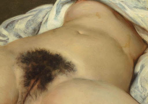
Manet often used controversial subjects such as beggars or prostitutes, which inspired other artists. I find this really interesting. I really admire that these artists took their inspiration from those without riches, glamour or desirable lifestyles. Whilst all of the paintings looked at feature very real subjects, I find these more realistic and emotive, as they’re human beings in a more natural form and relatable setting; in bed, in the park, on the sofa, with all lumps and bumps on show. It’s really refreshing to see women painted in an honest way, without any alterations made to the body; no curves erased, no imperfections edited out. A real woman! I never thought I’d see an image of one of those again. It’s very inspiring and comforting because, as a woman in 2020, it’s hard to not see skinny, flawless women on every billboard or magazine cover, and the women in these paintings are very normal, very beautiful, and very confident! I love it.


20th Century & Today

Moving into more contemporary portrayals of the human form, I discovered Egon Schiele; an Austrian painter and early advocate of Expressionism. His paintings of female nudes promote confidence and sexuality, and his abstract approach to them gives them a very unique and recognisable energy.

I love the almost unfinished quality of these pieces; it fills me with more confidence in my own work. I have more of an interest in quirkier, linear designs such as this, and would be super keen to reflect this in my future work. I have a tendency to hold back my own style as I want to fit into the course criteria and often feel anxious that I’ll go too far and it won’t be good enough. I spoke with my tutor about this and she told me to just go with how I feel and I feel way more confident with that. As you can see from Schiele, he has completely thrown caution to the wind and has gone down his own route in regards to creating form.

Simple, yet SO impactful.

And, of course, how could I forget iconic artists such as Picasso and Matisse, who’s contemporary portraits are something known and loved by all, whether you’re an art lover or not.

The approaches that these artists take on their subjects (specifically Picasso) are not conventional and by no means realistic; they view their subjects and they re-create them in their own style. I love the abstract, bizarre nature of these portraits and could look at them all day.

Picasso says things through his work in a way that best suits him and the piece he’s creating. Like other artists, he does not dedicate himself to just one style, but, in a way, lets the style choose him. One approach to painting that really shines through is that to Cubism; in Cubist paintings objects are broken apart and reassembled in an abstracted form, highlighting their composite geometric shapes and depicting them from multiple, simultaneous viewpoints in order to create physics-defying, collage-like effects. Both destructive and creative, Cubism shocked, appalled and fascinated the art world. Another approach that might be interesting and, again, stepping outside the box and really branching out. Picasso is real proof that anything is possible in art and limiting yourself is not the way to live your life.


Another artist that I briefly looked at was Lucian Freud, who maintained realism when things got a little wild. He uses tone and patches of colour to create close up portraits of human forms, mostly males. I find these paintings really moving and, for some reason, very European. I can’t quite put my finger on what exactly makes me feel this way, but it’s great. I really do like these pieces, however, this style isn’t quite my cup of tea. They’re a little boring and I don’t find them captivating in the same way as the Picasso or Matisse paintings. Maybe a little taste of the weird and wonderful has dulled my appreciation for anything slightly normal for now.

I will say that, whilst all of the above paintings are wonderful and absolutely breathtaking in their own ways, I do much prefer contemporary approaches to the human figure.


References:

https://comicvine.gamespot.com/prehistory/4015-56169/images/

https://indianapublicmedia.org/amomentofscience/art-began.php

https://en.wikipedia.org/wiki/Bradshaw_rock_paintings


http://ancientromanartarchitecture.weebly.com/theatre.html

https://images.app.goo.gl/ubbEPxBEZ5J722rR8


https://philipmould.com/artworks/categories/old-masters/16th-17th-century/

http://www.alaintruong.com/archives/2018/10/19/36796712.html


https://www.studyblue.com/notes/note/n/18th-and-19th-century-art-final/deck/8911248

https://www.nga.gov/collection/art-object-page.61398.html

https://www.manet.org/olympia.jsp

https://www.widewalls.ch/magazine/le-dejeuner-sur-lherbe-edouard-manet

http://allart.biz/photos/image/Gustave_Courbet_1_The_Origin_of_the_World.html


https://www.metmuseum.org/art/collection/search/483456

https://www.tate.org.uk/whats-on/tate-liverpool/exhibition/life-motion-egon-schiele-francesca-woodman/five-things-know-egon

https://www.artsy.net/artwork/egon-schiele-schiele-drawing-a-nude-model-in-front-of-a-mirror

https://www.nytimes.com/2018/02/28/arts/design/picasso-painting-sothebys-69-million.html

https://www.tate.org.uk/art/artists/pablo-picasso-1767

https://www.saatchiart.com/art/Painting-Portrait-Pablo-Picasso/1311333/6500245/view

https://www.albrightknox.org/artworks/rca194013-la-musique

https://www.reproduction-gallery.com/oil-painting/1138556469/woman-with-a-veil-1927-by-henri-matisse/

https://www.thechapelarts.com/lucian-freud/

https://imma.ie/collection/reflection-self-portrait/


Assignment 3

Coursework

The brief for this piece was that we recreate an outdoor scene of our choice, bringing together both natural and man-made subjects. As we have focused on land and townscapes, a scene with both would be the perfect setting to tie up this part of the course. Luckily, I live in a fairly suburban area of London so access to both buildings and greenery wasn’t too tricky for me. I didn’t even have to leave my house!

I was looking out the window of my bathroom and I noticed that the houses behind ours would be the perfect viewpoint, as they are easily accessible, and are surrounded by trees and plants in the gardens.


Viewpoint

I began by taking photographs of this chosen area from different viewpoints.

I decided straight away that viewpoint 1 was a no go.
This viewpoint almost completely blocks out the buildings and the greenery completely takes over the shot. Whilst it looks pretty, I felt that it wouldn’t be best for experimenting and putting into practice the skills that I have learnt over Expanse.

Viewpoint 3 and 4 are basically the same, however, in viewpoint 4 I lifted my arms as high out of the window as possible. If only I were able to climb onto my roof, I would have been able to get an even better viewpoint. These two are good views, they show some of the greenery and a lot of the buildings, but I wasn’t drawn to them like I was drawn to viewpoint 2.

Viewpoint 2 is my chosen perspective because it’s got the right amount of everything. From this view (out of the bathroom window) you are able to see basically half of everything. Also, when looking at the different photos I found this one the most inviting and the most inspiring. I think the buildings look a bit depressing if I’m honest; the bricks are dull, the scaffolding is ugly and some of these homes could use some TLC.
The vibrant colouring of the leaves adds something exciting to what is otherwise a very drab scene, and it’s this contrast in tone and feeling that I found so intriguing.


Preliminary Sketches

I decided to experiment with the different viewpoints, to see which one felt the best when drawing it.

Preliminary sketch 1:
In my head I knew that this was not going to be the chosen point of view that I took to this scape. Whilst it was an interesting one to have a quick go at, I knew I needed a more adventurous viewpoint to put into play all the areas I’ve covered in Expanse. I would struggle to show depth and perspective in this piece, as the greenery takes up so much of the shot.

Preliminary sketch 2:
The best of the bunch, without a doubt! I was anxious approaching this viewpoint. I know I said above that I knew I needed to branch out and be a bit more adventurous, but all those lines and angles and subjects terrified me for a moment or two, however, this quick sketch was easier and turned out better than I expected. Even in a rough sketch that took a couple of minutes I was able to display accurate perspective. From an aerial view you are able to see far more, and things become more angular, especially linear subjects such as buildings. I find this tricky, but I’ve seen improvement over the past few exercises.

Another reason that I wanted to choose this viewpoint; I have seen improvement in an area that I’ve really struggled with in the past, and wanted to show that in my final piece.

Preliminary sketch 3:
In this sketch, I felt something similar to sketch 1. In this particular sketch there’s too much building and not at all enough natural subject. This sketch was created using Viewpoint 3, where the buildings dominate the majority of the shot. Again, from a high vantage point, I was able to view the many, many lines and angles of the buildings – the extensions, the slope of the roofs, the chimneys protruding out of them, and the windows/doors. There are so many aspects of this to include, which would be incredible further practice, however, I felt that I really needed to have more natural subjects such as trees and plants and stuff, which drew me back to the 2nd viewpoint, as this had a good amount of both.

Creating these preliminary sketches just solidified in my mind how right my choice to use Viewpoint 2 is. The range of techniques I would need to create that piece was daunting but also exciting; creating two subjects that are so different from each other will be interesting but I’m looking forward to it. Working on landscapes and then moving to townscapes has been a lot of fun, but I’ve not really combined the two of them in much of my work, so I’m excited to get stuck into the next bit (if not slightly petrified).


Final Piece

So, here it is: the final outcome.

I spent a long time on this. Probably a lot longer than I should have, to be honest.

I feel a bit upset because, in my opinion, it’s a bit rubbish. I tried really hard with it, but it just doesn’t seem to be quite right. I also find that I’ve been really comparing myself to other students who seem to be miles better than I am at this stuff, but I guess it’s all a learning curve. I’m also incredibly frustrated because I took loads of progress photos of this process and I’ve lost every single one of them, so I could just scream!

I’ll walk you through it…

First of all, I sectioned the photograph into quarters.

I found that this really helped me when creating the previous two townscape exercises. Adding the grid to this photo and then adding the same grid to my page helped me map out in my head and then on the page where the centre point was and where I should begin. At the beginning, I thought the middle window was bang in the centre of the shot, but, as you can see, I was mistaken.

I moved on to then lightly add in all the vertical lines of the buildings, followed by the horizontal lines. Now I had all the buildings mapped in as well as the roofs, windows, doors and any other linear features. I didn’t bother to map in the trees as I felt that I should just work freehand with the media that I chose for them.

I used a range of media to create this piece – pastels, charcoal, conte sticks, acrylic paint, watercolour paint, and even a small amount of oil paint. The most media I have ever used in one piece. I felt that with a range of subjects it would be silly to limit myself to just one or two, so I branched out and used whichever media felt good at that time. I’ve decided to not hold back on my pieces. Beforehand I was apprehensive to go wild with my work as I was worried that it wouldn’t fit within the course guidelines, but a few of the previous exercises have advised us to experiment and to not be afraid to hold back. I want my personality to show through my work, so that’s what I’m trying to achieve.

First, I used a range of pastels to frottage the colours onto the buildings. I felt that this technique was really useful in depicting the texture of brick. Whilst I am pleased with the outcome of this choice, I’m not confident that it was the best one. I experimented with acrylic paint as well, however, my partner accidentally threw away the sheet that I did this on. Yet another frustration. Regardless, the pastel was the best bet for me. Maybe my colour choices aren’t as accurate as they could be, or the pressure applied to the pastels isn’t as it should be, but something just isn’t quite right about this; I can’t put my finger on what, exactly.

I’m pleased with areas of the trees. I think there are points where I have gone too far, but my tutor advised me this would sometimes be the case. Taking progress photographs is good to see where I should have stopped or what I could have done differently. Unfortunately I ALWAYS seem to forget to take progress photos, grrrr! I am trying to remember but I get so caught up in creating that it slips my mind.

I used a range of acrylic paints, water colour paints and pastels for the trees. One thing that I think I’ve managed to portray is the depth of the leaves; some areas are thinner than others, and some leaves are darker than others, or in shade, and I think this is believable in this piece.

I used oil and acrylic paint with some pastel for the sky. This is an aspect that I am quite pleased with. I think I have managed to maintain a sense of realism within the sky, and this gives the piece more depth. To me, I can see that there is a background, middle-ground and foreground within this piece. It feels layered, which is something I was worried I wouldn’t be able to portray. I asked my partner if he could see the different layers of the piece and if he felt any depth at all, and he advises me that yes, he could, so that’s a relief.


I’ve still got a way to come, I know that.
I’m not expecting to be incredible after only a couple of months of practice in this area, but I’m not feeling very confident as of late. I go back to work full time this week and I’m even more anxious that I won’t have the extra time to work on this. I’d like to re-create this piece or something similar in the future, maybe in a more abstract style. I often work in abstract, but I feel slightly apprehensive to put this into my work, as it doesn’t best show the skills that I’ve learnt over this time. That all being said, I have really enjoyed Expanse. Part of me is really looking forward to moving on, but another part will really miss it. I’ve picked up a lot of skills and I’ve learnt a lot that I will put to further practice in the future.


Statues

Coursework

Project 5

Exercise 4


For this exercise we were asked to look for statues in streets, parks, cemeteries, town squares, and any other places we could find them. I struggled to get out of the house for this one as there was a stretch of days where it just rained and rained and rained, so I turned to google.

I’d like to add that I am so far out of my comfort zone with this one. Figures are not my area of expertise and I find them quite daunting; the main reason being that I can never seem to get them quite right.

I’m feeling deflated, I won’t lie.

I don’t really like any of the above statues. I really struggled to depict the perspective in which I was viewing them and, as mentioned above, I struggle to put pen to paper and describe what I am seeing when focusing on a human form or statue. That being said, I gave it a go and I’m glad that I did. I guess the whole reason I am even doing this course in the first place is so learn, so I’m hoping that, eventually, I will get there.

My favourite of the three pieces above is the statue on the right. If you chop the poor statues head and feet off I think I’ve done pretty well. I struggled with accurately portraying her height, and the shape of her body and limbs but I got there. Just about. I think it helped that she doesn’t have any arms, so there were two less things to stress about but I’m pleased with the outcome of her legs, in particular. Her left leg was angled backwards and, whilst this seemed like an easy thing to portray, it wasn’t, but I tried and tried and tried some more and I think I have finally been able to show that movement. I found that smudging the pencil with my fingertip helped a lot with this particular statue. Using this technique to blend the pencil from darker tones to lighter tones gave the statue a more realistic and smoother appearance.

The first sketch was my first statue, and I think, despite the fact that there’s a lot of room for improvement, it didn’t turn out too bad. The viewpoint towards this statue was from beneath it and I hope and think I have in some way managed to show this. His upper body above his folded arms is completely hidden and so the view I had went straight from arms to neck; a few times this turned out looking completely bizarre but I had a rubber handy and I kept trying until I felt that it looked somewhat normal. His face was the tricky part.

Faces in general are something that I’ve always struggled to draw, and it’s because of this that I’m feeling quite anxious about the next part of the course.

I think, for now, approaching this task in pencil is my safest bet.
I did consider having a go with pastels or some charcoal, but I think whilst I’m still finding my feet in this area, I’d like to keep at least one of my feet in my zone of comfort.


A limited palette study

Coursework

Project 5

Exercise 3


For this task we were asked to use our previous sketches and to develop them in colour.

The previous piece was of a group of buildings in my local area, so I attempted the same scene from the same viewpoint using a range of coloured pencils. I had pastels and coloured pencils available, however, I felt that the pastels were too thick and waxy for this. After creating the sketching the scene in line, I wanted to keep that smooth, precise appearance when moving on to adding colour to it.

First, I began by drawing in the strongest verticals of the primary focus, which was the building in the centre.

After mapping in the vertical lines of the central building, I moved on to the diagonals, and then the vertical lines of the buildings and subjects surrounding the central building.

From then, I added some detail, applying pressure to the pencils to include the colours that I could see in the buildings. I liked the appearance of the soft, subtle pencil strokes and wanted to maintain that through the piece. After I had the general base colours in I wanted to then return to work on textures and tones.

Applying small amounts of pressure to the pencil and layering the colours I was able to gradually build up the surface and the tonal values. I maintained a similar strategy to the previous exercise, and once finished with the colours and differing tones, I moved on to add fine lines and right angles to depict the form of the bricks in the wall, and even added some subtle shadowing and shade to some areas.


I’m pleased with this piece. Not as pleased as I was with the previous exercise, working on it in only line.

There are still some areas that I need to work on. Texture, being one of them. I’ve really liked working in line and colour here, and I’m really satisfied with the style in which I’ve created this piece, however, I would be keen to return to it to experiment with the creating of texture – the bricks, the pavement, the wooden doors and window panes. I think part of me was apprehensive to add these features in case I ruined the piece, but I need to be aware that there is no such thing as bad art.

The sky was completely clear and bright blue when I approached this piece and I wanted to reflect that somehow. I wasn’t sure quite how, due to the limited palette and my choice of colours, so I thought the most effective way to depict this was to leave it blank and I’m pleased with my choice. Had I the chance to use a blue coloured pencil I would have used it, but, for now, this will do.

Working on a townscape in colour is very new to me. It’s interesting and exciting but it’s very out of my comfort zone, which unsettles me a bit. I’m always a bit anxious that I’ll spoil a piece or that it won’t be perfect. As I said above, I am pleased with the outcome of this but I think I have much more to give, and I’m interested in looking into my abilities within this area.

Yes, I do think I’ve created some sense of depth, but, again, I feel that there could be much more.
The depth depicted in the townscape with line was far more apparent, but maybe that is just because I am far more used to working with pen and line than colour and tones. I’m able to see severe improvement which is a huge relief, but there’s still some way to go yet. Whatever the weather though, I’m feeling optimistic and I am confident that I’ve done well in this part of the course.


Study of a townscape using line

Coursework

Project 5

Exercise 2


For this exercise we were asked to begin by making a preliminary sketch across two sketchbook pages.
In this part of the task we were to establish the primary focus and any shapes and objects necessary to make the drawing an interesting piece.

I decided to focus on a group of buildings in my local area, with an interesting building as the focal point.

I established a back, middle and foreground in the preliminary sketch, also using it to note down the weather, the general mood I felt whilst drawing and any other things that came to mind. There was a point that I began to feel rather agitated with this exercise. It was then that I began looking at other student’s blogs to see how they had approached it and realised that the preliminary sketch didn’t need as much detail as I was putting into it.

It was then that I decided that all the basic shapes and features were included and that I was ready to move on to the next part of the task.


I will say now that yes, the preliminary sketch did help me a lot when it came to creating the more final version of this townscape. I was able to use the middle of the book to work out the middle point of the page and then work outward from there. It might be interesting to return to this in the future, as I think it was really supportive in the success of the below drawing.

I used a black fine liner and a ruler to recreate the buildings and the objects surrounding them. Originally, I had picked up the ruler to map in the general shapes of the buildings, however, it got to the point that I thought the angular, exact appearance of the lines looked brilliant, and I wanted it throughout the piece.

Once I had added in the building shapes, I moved on to adding their features – the windows, doors, and anything else that was part of their character. Each building in this piece is different, which I love, and which was an aspect I wanted to capture. I’d like to think I have done that.

Fast forward towards the end of the task, all the lines were added and all the subjects included in the drawing. I then wondered for a moment how I should go about shading the darker areas. I wanted to make this piece mine and throughout the exercise I had held a vision in my head of what I wanted to do with the shaded areas. After a little while I just decided to go for it and shaded in these areas completely with a pigment brush pen and I am so pleased with the result.

I think, in my opinion, that this is one of my best pieces from the work I’ve created during Expanse. It’s more my kind of style; I love working with pen and fine lines and this was exactly what the task entailed.

If I were to complete it again, maybe I would experiment with a range of shading techniques. I was eager to jump straight in with this one, and, whilst I’m really pleased with the outcome, it would have been interesting to see if there were any others that suited the piece better.

I think my perspective is fairly accurate, however, there are some areas that I can see need improvement. I had been working on this piece for a long time, and I think towards the end I got a bit sloppy as I wanted to finish it. Another feature I would be keen to alter or experiment with is the windows. I didn’t want to spoil the piece by shading or adding to the windows, so I’ve just left them. I’m interested in talking to my tutor regarding this to see what her thoughts are or if she has any ideas. Perhaps I will return to it after hand in and tweak it a little.

Overall, I’m happy. My attention span is fairly short, however, I sat for a good few hours working on the two parts of this task and I am chuffed with how it turned out.


Sketchbook of Townscape Drawings

Coursework

Project 5

Exercise 1


For this exercise we were asked to focus on townscapes, drawing them in 10cm square boxes. I live in London so this was a fairly easy task, as city buildings are easily accessible in my area.

I drew these townscapes on the same day in the same general area. The day was fairly bright but occasionally overcast, as you’d expect in late August.


This first sketch is of a group of houses a few doors down from me. These houses round a corner, which was an aspect I found tricky to portray in this sketch. I think, had I more time, I would’ve found it easier to show this, but working quickly meant less time to perfect details.

The house in the centre was my main focus, as we were advised to do in the brief. I worked this house in and then added the houses and features that surrounded it. As you can see, on the house on the left-hand side I have added more shading and darker tones; this is because this house is not hit directly by the sunlight, like the central and right-hand house are. The house on the right in particular was not at all shaded, so the light hitting it softened its details (e.g. the brickwork, the windows edges). With the short amount of time I had to create this, I think I did a fairly good job of portraying these things.


The next sketch I did was a house a few streets down, however, I zoomed into one section of – the front gate.

The weather was slightly overcast for this one. It was still a bright day, however, there was no strong sunshine so the shadows cast weren’t as severe as they had been in the previous sketch. I didn’t enjoy creating this piece, as you can see by my notes above. The colouring of the bricks, the gate and the house itself was very drab and I think this reflected on my mood. The weather possibly played a part in that as well.

Whilst I think it’s clear what I have drawn above, it lacks character and there’s something about it bugging me. Again, I do believe this might have something to do with the fact that I was asked to draw quickly and couldn’t take time to add finer details or perfect lining and perspectives.


For the last thumbnail sketch I thought I’d branch out a bit more and sketch an area of my local train station. This one proved trickier than I expected, but I don’t think I did too bad a job. Again, the weather was overcast, so there was no strong sunlight on the scape. That being said, I did enjoy this one, even though it was a bit of a challenge.

I do have an emotional connection to this place, as it reminds me of travelling. The emotions I feel towards this station are mixed, as I use this route to go to work, but also to visit friends. I’ve never attempted to draw a scene like this, as I’ve always thought train tracks and tunnels would frustrate me too much, but after inspecting the view in front of me for a while I was able to mentally map out what I needed to do. I think that working quickly actually benefited me for this sketch, as I didn’t have time to overthink or worry about things not being right, I just worked around and over things that weren’t right.


For the next part of the exercise, I returned to the house focused on in the middle piece, with the front gate. I don’t know what drew me back to this piece, as it was my least favourite of all the scapes that I drew; maybe I wanted to give it another go to see if I liked the second attempt more? Funnily enough, I did. I enjoyed it more and I felt less annoyed and negative towards it.

Again, working quickly I drew the house with a black biro. Mapping in the house in the centre, I worked from there – adding the windows, the angles, the doors, the ledges, the front gate and wall, and then adding the houses and markings around that. There is a house to the left of this house, and also a house to the right, however, this one is further in the background.

I feel mixed feelings towards this final outcome. I think I’ve depicted the layers of the piece pretty well, and I also think the proportion of the house looks right due to the angles of the windows and the wall in comparison to the house. Working quickly sometimes really helps me; I think I often think too much if I’m working at a slow pace and often end up going too far past the point of salvaging a piece. Drawing quickly leaves less time to scrutinise and less time to ponder over things; you just do them and then work with it.

Townscapes is shaping up to be really enjoyable so far, and I’m really keen to continue!


John Virtue

Coursework

John Virtue is an English landscape painter whose work rides a fine line between abstraction and figuration.
For his work, Virtue takes a great deal of inspiration from artists such as Turner and Constable, however, he’s also greatly influenced by American abstract expressionism and oriental brush painting.

Virtue focuses on the landscapes around where he happens to live. At the beginning of his artistic career he lived in Devon, and used the Exe estuary as his subject. He now lives in London, hence why his landscapes have turned down a more industrial route.

As you can see above, Virtue works solely in black and white, executing all of his paintings on canvas using white acrylic paint, black ink and shellac.

I absolutely love these paintings. I’ve not come across John Virtue before, but I’m exceptionally happy that I have. I have had some ideas in the past that are similar to these pieces, however, for some reason or other, I’ve always seemed to steer in another direction.

It’s impossible not to be sucked into these pieces.
The contrast in tone is nothing spectacular, but it drew me in and I find it absolutely fascinating. One thing that I noticed, or rather interpreted, from these pieces is that they are very full of weather. The day seems overcast, full of clouds and a bit grim, which is reflected beautifully in his use of media. The dark tones completely take over the paintings, and the only way you’re able to really recognise a building or a bridge or an edge of a building is through Virtue’s use of lighter tones; the white acrylic that he uses to portray the windows and light reflections in the above paintings is a small section, but a huge part in transforming them into something bigger.

Another thing that I noticed is the use of layering; a technique that we focused on in a previous exercise.
Although the artist doesn’t use a great amount of detail in his work, I noticed that the further the distance from the viewpoint, the focus lessens; edges become softer, changes in tone become subtler, and subject structures are vaguer. It’s tricky to notice these details in Virtue’s work as he hardly works in a highly defined and specifically detailed manner, but it’s there.

I experimented in a few landscape exercises with black and white, however, this was only through the use of charcoal and blank space. It would be really interesting to have a go at creating a landscape similar to Virtue’s – the same approach, the same media, and, as we both live in the same city, even the same surroundings!


Aerial or atmospheric perspective

Coursework

Project 4

Exercise 3


For this exercise we were asked to focus on an aerial or atmospheric perspective and the tonal gradation within it. Whilst focusing on landscapes and perspective we have also focused on detail and focus and how it reduces as the horizon gets further away from the eye.

I looked at images of aerial and atmospheric landscapes online, and was drawn to this piece.

First, I established the horizon, mapping it in with a grey pastel.

After adding this in, I plotted the basic forms within the landscape, which were the trees.

After this, I began shading in the range of colours that I could see, starting with the areas furthest from my eye. The areas in this image that are furthest away lack great detail and only the varied colours were obvious. I then began building upon this, adding the colours that I could see, blending them together, and layering them up.

After I had added all the base colours and all the different tones I could see, I began to add in the finer details on the flowers in the foreground. As you can see, I have established the foreground, middle ground and background. I’ve done this by steadily reducing the focus and detail as the distance increases.


I’m really pleased with this piece. I put a fair amount of effort into it, and of all the landscape pieces I’ve created, this is my favourite.

I think I’ve done well to establish the different layers really well. The background is extremely out of focus; only the shape of the trees is clear, none of the details on them. Moving forward, you can see that the middle ground is becoming clearer, however, it is by no means in focus and still lacks any detail. As the tree is fairly large and it’s tone is dark, it becomes more focused than the ones in the background, and more focused than any of the other subjects in this area. This is because the flowers are small and crowded together; they blend into one another and become a mass of colour. Slowly, the middle ground blends into the foreground and this is where you are able to see the flowers and grass come into focus. The red and purple flowers and the green grass become separate from one another, and you are able to see the finer details upon them – the white markings on the purple flowers, the paler reddish tones on the red flowers, and the range of green tones in the grass.

I think I’ve done really well with this piece. I’m really proud.
It’s been so interesting to experiment with a range of perspective. This is something I’ve always taken interest in but haven’t practiced for a long time. It’s been fun to engage in these exercises and I’m now really looking forward to the next area of Expanse.


Angular Perspective

Coursework

Project 4

Exercise 2


For this exercise we were asked to create a line drawing of either a building/several buildings or an arrangement of books on a table seen corner-on. I wasn’t able to access any buildings at this view, however, I have many books, so I decided to take that approach to this task.

My first attempt was using the layout above.

After drawing the books, adding in my eye- line (horizontal blue) and then drawing in the receding lines (red), I realised that the piece should probably be more angular. My perspective wasn’t the best it could be, as only one of the books was viewed ‘corner-on’.

I decided to attempt it again, using the same books, but angling them differently.

I shifted the books around so, from my viewpoint, a corner of each book was pointed towards me, or at least in my general direction. This helped me greatly in displaying a range of receding lines from the different angles.

Exercises such as this frustrate me, because I can never seem to get the proportion or perspective right.
For objects that are very angular I think this shows that a ruler is an important tool to have to recreate these them accurately. At least until I have gained more experience and skill in freehand perspective drawing. I also think it may help a great deal to work out and draw the perspective lines prior to the drawing, instead of blindly drawing the angles and lines that you see. It always seems that I see something a certain way, but when it comes to putting pencil to paper, it seems near impossible to recreate what I see.

I wasn’t sure whether I should include the receding lines for the edges of the book that are bent up or not entirely straight. I’ve left those lines out, just in case.

All of the books, regardless of their angle, should have vanishing points on the eye-line, which, as you can see, I’ve not managed to achieve here. I think it’s clear to say that some work is needed here!


Parallel Perspective – An Interior View

Coursework

Project 4

Exercise 1


For this exercise, we were asked to draw an interior in perspective, then apply red lines to see how accurate my perspective eye was. I felt that I did better than I anticipated, however, there’s much work to do.

I’ve been interested to get stuck into perspective pieces, as this is something I’ve enjoyed but struggled with in the past. I find exercises such as this frustrating, but surprisingly satisfying.

Knowing that I was unable to use a ruler or a rubber, I think I subconsciously took extra care with this piece.

I began the piece by drawing the doorway closest to me, which, in hindsight, I think was a very good choice to base the rest of the drawing on. I wasn’t sure where to start with it, but I’m really pleased with my decision to start in the centre and work around that.

I had hoped that there would be a main vanishing point, however, I wasn’t expecting any miracles. Considering this was my first attempt, I’m really pleased with the outcome. As you can see under the mess of red lines there is actually a vanishing point where two lines join in the centre, but other than that, it’s all a bit messy.

Something that I find tricky with exercises like this is the fact that your point of perspective can really throw lines off. Working without perspective lines or ruler is great practice, but it’s extremely difficult to achieve an accurate representation of what I can see in front of me. I worked on this a lot in high school, but haven’t returned to it in some years. It’s amazing how it all comes flooding back to you, but still, I’m feeling really keen to get practicing on this area, as it was always one of my favourite aspects of drawing.